Quantile–Quantile (QQ) Plot
Maths: Statistics for machine learning
2 min read
Published Oct 22 2025, updated Oct 23 2025
Guide Sections
Guide Comments
A Quantile–Quantile (QQ) Plot is a visual tool used to compare the distribution of your data against a theoretical distribution (such as the Normal Distribution).
It plots the quantiles of your sample data against the quantiles of the reference distribution.
In simple terms:
“A QQ plot helps you see whether your data follow a straight line — if they do, it means your data come from the same distribution.”
How It Works
- The x-axis represents the theoretical quantiles (from a known distribution, like Normal).
- The y-axis represents the sample quantiles (from your data).
- If the data follow the theoretical distribution, the points will lie close to a straight diagonal line (y = x).
Interpreting a QQ Plot
Pattern | Meaning |
Points lie close to diagonal | Data follow the theoretical distribution |
Points curve upward (above line at right tail) | Right-skewed (heavy right tail) |
Points curve downward (below line at right tail) | Left-skewed (heavy left tail) |
S-shaped curve | Data are more spread out or less variable than the reference distribution |
Large deviations at ends (tails) | Outliers or heavy tails compared to the normal distribution |
Why It’s Useful
- Tests whether your data are normally distributed (normality check).
- Detects skewness, kurtosis, and outliers.
- Helps decide whether parametric statistical tests (which assume normality) are appropriate.
- Commonly used before applying regression, ANOVA, or t-tests.
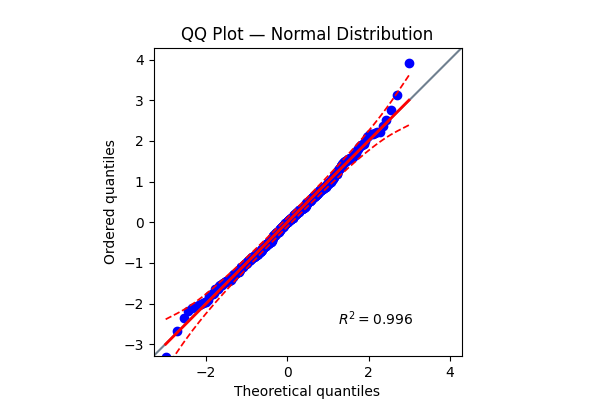
Shows points close to the straight diagonal → data are approximately normal.
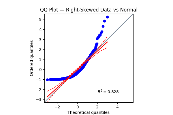
Curves upward → right-skewed distribution, not normal.
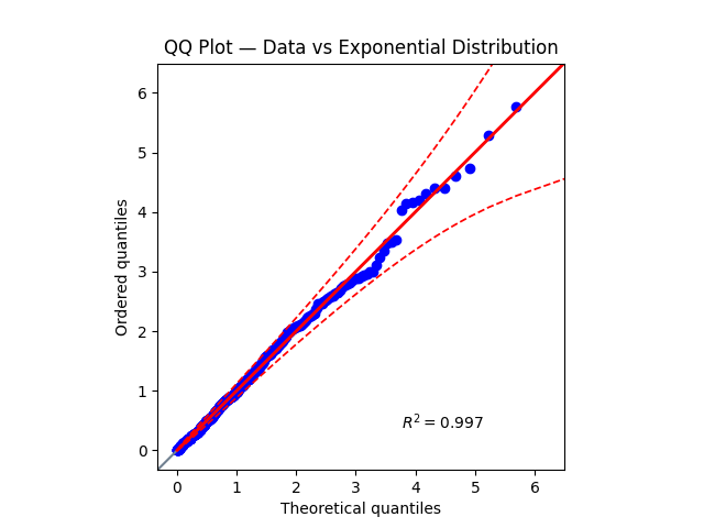
Points align better with the exponential reference, confirming a better fit.
Products from our shop
Docker Cheat Sheet - Print at Home Designs

Docker Cheat Sheet Mouse Mat

Docker Cheat Sheet Travel Mug

Docker Cheat Sheet Mug
Vim Cheat Sheet - Print at Home Designs

Vim Cheat Sheet Mouse Mat

Vim Cheat Sheet Travel Mug

Vim Cheat Sheet Mug

SimpleSteps.guide branded Travel Mug

Developer Excuse Javascript - Travel Mug

Developer Excuse Javascript Embroidered T-Shirt - Dark

Developer Excuse Javascript Embroidered T-Shirt - Light

Developer Excuse Javascript Mug - White

Developer Excuse Javascript Mug - Black

SimpleSteps.guide branded stainless steel water bottle

Developer Excuse Javascript Hoodie - Light
