Bar charts - horizontal
Matplotlib Basics
1 min read
This section is 1 min read, full guide is 24 min read
Published Oct 5 2025
15
Show sections list
0
Log in to enable the "Like" button
0
Guide comments
0
Log in to enable the "Save" button
Respond to this guide
Guide Sections
Guide Comments
ChartsGraphsMatplotlibNumPyPandasPythonVisualisation
The barh() function creates horizontal bars.
Syntax:
plt.barh(y, width, height=0.8, left=None, color=None, edgecolor=None, label=None, alpha=1.0)
Copy to Clipboard
Parameters:
y→ category positions (or names)width→ bar lengths (data values)height→ bar thicknessleft→ starting x-position (for stacking)color→ bar fill colouredgecolor→ colour of the bar borderlabel→ legend labelalpha→ transparency (0 to 1)
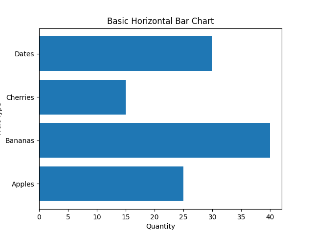
Basic horizontal bar chart example
import matplotlib.pyplot as plt
categories = ['Apples', 'Bananas', 'Cherries', 'Dates']
values = [25, 40, 15, 30]
plt.barh(categories, values)
plt.title("Basic Horizontal Bar Chart")
plt.xlabel("Quantity")
plt.ylabel("Fruit Type")
plt.show()
Copy to Clipboard
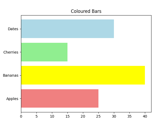
Bar colours
import matplotlib.pyplot as plt
categories = ['Apples', 'Bananas', 'Cherries', 'Dates']
values = [25, 40, 15, 30]
plt.barh(categories, values, color=['lightcoral', 'yellow', 'lightgreen', 'lightblue'])
plt.title("Coloured Bars")
plt.show()
Copy to Clipboard
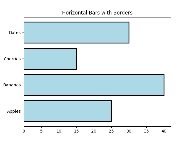
Edge colour and line width
import matplotlib.pyplot as plt
categories = ['Apples', 'Bananas', 'Cherries', 'Dates']
values = [25, 40, 15, 30]
plt.barh(categories, values, color='lightblue', edgecolor='black', linewidth=2)
plt.title("Horizontal Bars with Borders")
plt.show()
Copy to Clipboard
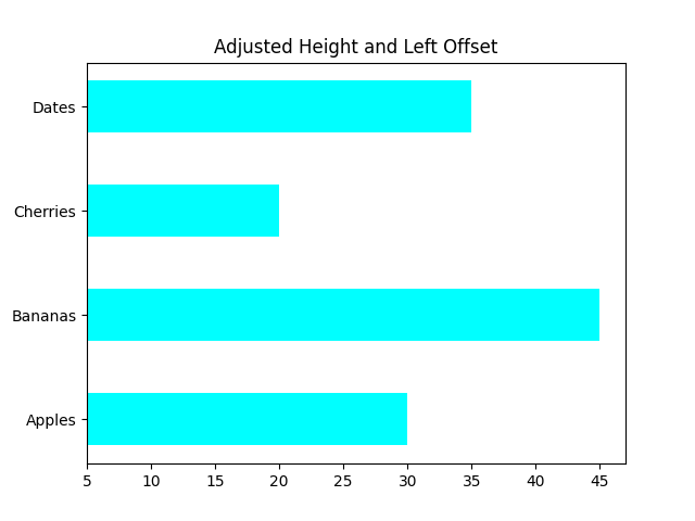
Bar height and offset
import matplotlib.pyplot as plt
categories = ['Apples', 'Bananas', 'Cherries', 'Dates']
values = [25, 40, 15, 30]
plt.barh(categories, values, height=0.5, left=5, color='cyan')
plt.title("Adjusted Height and Left Offset")
plt.show()
Copy to Clipboard
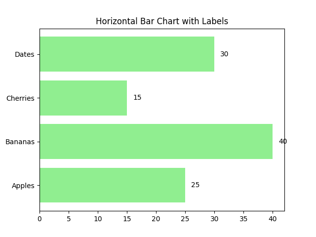
Add labels on bars
import matplotlib.pyplot as plt
categories = ['Apples', 'Bananas', 'Cherries', 'Dates']
values = [25, 40, 15, 30]
bars = plt.barh(categories, values, color='lightgreen')
plt.title("Horizontal Bar Chart with Labels")
for bar in bars:
plt.text(bar.get_width() + 1, bar.get_y() + bar.get_height()/2,
str(bar.get_width()), va='center')
plt.show()
Copy to Clipboard
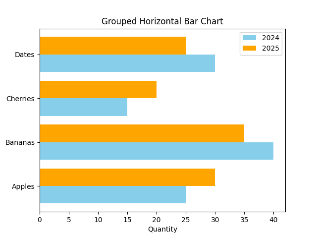
Grouped horizontal bar chart
import matplotlib.pyplot as plt
import numpy as np
y = np.arange(4)
values_2024 = [25, 40, 15, 30]
values_2025 = [30, 35, 20, 25]
plt.barh(y - 0.2, values_2024, height=0.4, label='2024', color='skyblue')
plt.barh(y + 0.2, values_2025, height=0.4, label='2025', color='orange')
plt.yticks(y, ['Apples', 'Bananas', 'Cherries', 'Dates'])
plt.xlabel("Quantity")
plt.title("Grouped Horizontal Bar Chart")
plt.legend()
plt.show()
Copy to Clipboard
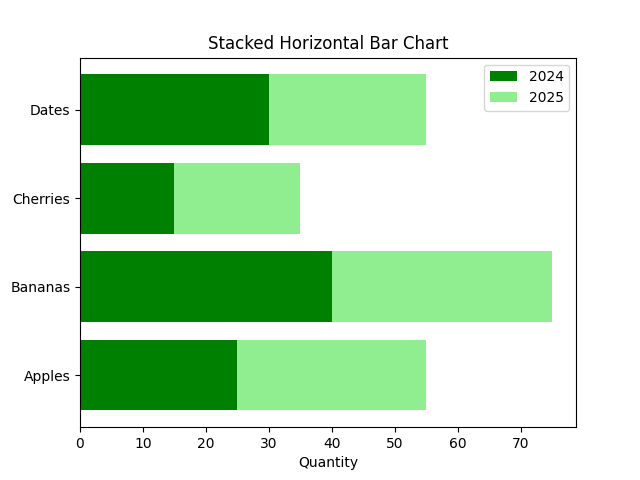
Stacked horizontal bar chart
import matplotlib.pyplot as plt
import numpy as np
categories = ['Apples', 'Bananas', 'Cherries', 'Dates']
y = np.arange(4)
values_2024 = [25, 40, 15, 30]
values_2025 = [30, 35, 20, 25]
plt.barh(categories, values_2024, label='2024', color='green')
plt.barh(categories, values_2025, left=values_2024, label='2025', color='lightgreen')
plt.title("Stacked Horizontal Bar Chart")
plt.xlabel("Quantity")
plt.legend()
plt.show()
Copy to Clipboard
Products from our shop
Docker Cheat Sheet - Print at Home Designs

Docker Cheat Sheet Mouse Mat

Docker Cheat Sheet Travel Mug

Docker Cheat Sheet Mug
Vim Cheat Sheet - Print at Home Designs

Vim Cheat Sheet Mouse Mat

Vim Cheat Sheet Travel Mug

Vim Cheat Sheet Mug

SimpleSteps.guide branded Travel Mug

Developer Excuse Javascript - Travel Mug

Developer Excuse Javascript Embroidered T-Shirt - Dark

Developer Excuse Javascript Embroidered T-Shirt - Light

Developer Excuse Javascript Mug - White

Developer Excuse Javascript Mug - Black

SimpleSteps.guide branded stainless steel water bottle

Developer Excuse Javascript Hoodie - Light
