Box plots
Matplotlib Basics
2 min read
This section is 2 min read, full guide is 24 min read
Published Oct 5 2025, updated Aug 17 2026
15
Show sections list
0
Log in to enable the "Like" button
0
Guide comments
0
Log in to enable the "Save" button
Respond to this guide
Guide Sections
Guide Comments
ChartsGraphsMatplotlibNumPyPandasPythonVisualisation
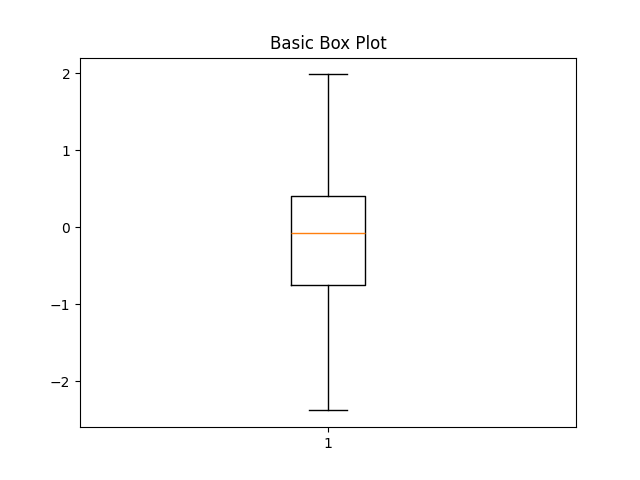
A box plot summarises a dataset’s distribution using five key statistics:
- Minimum (lower whisker)
- First quartile (Q1) — 25th percentile
- Median (Q2) — 50th percentile
- Third quartile (Q3) — 75th percentile
- Maximum (upper whisker)
It may also show outliers (points beyond the whiskers).
Syntax:
plt.boxplot(x, notch=False, vert=True, patch_artist=False, labels=None, widths=None, showmeans=False, meanline=False)Parameters:
x= Data (list, array, or list of lists)notch= Adds notch around median (confidence interval)vert= Vertical (True) or horizontal (False) orientationpatch_artist= Fill the boxes with colourlabels= Labels for each datasetwidths= Width of boxesshowmeans= Show the mean valuemeanline= Draw mean as a line instead of pointflierprops,boxprops,medianprops,whiskerprops= Customize element styles
Basic box plot
import matplotlib.pyplot as pltimport numpy as npdata = np.random.randn(100)plt.boxplot(data)plt.title("Basic Box Plot")plt.show()Shows distribution, median line, quartiles, whiskers, and outliers.
Multiple Box Plots
Pass a list of datasets to compare side by side.
import matplotlib.pyplot as pltimport numpy as npdata1 = np.random.normal(0, 1, 100)data2 = np.random.normal(1, 2, 100)data3 = np.random.normal(2, 1.5, 100)plt.boxplot([data1, data2, data3], labels=['A', 'B', 'C'])plt.title("Multiple Box Plots")plt.show()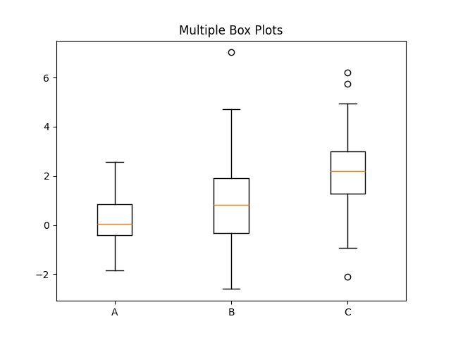
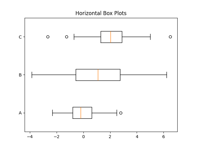
Horizontal orientation
import matplotlib.pyplot as pltimport numpy as npdata1 = np.random.normal(0, 1, 100)data2 = np.random.normal(1, 2, 100)data3 = np.random.normal(2, 1.5, 100)plt.boxplot([data1, data2, data3], vert=False, labels=['A', 'B', 'C'])plt.title("Horizontal Box Plots")plt.show()Great for long category names.
Notched Box Plots
Notches show a rough confidence interval around the median. If two notches don’t overlap, medians differ significantly.
import matplotlib.pyplot as pltimport numpy as npdata1 = np.random.normal(0, 1, 100)data2 = np.random.normal(1, 2, 100)data3 = np.random.normal(2, 1.5, 100)plt.boxplot([data1, data2, data3], notch=True, labels=['A', 'B', 'C'])plt.title("Notched Box Plots")plt.show()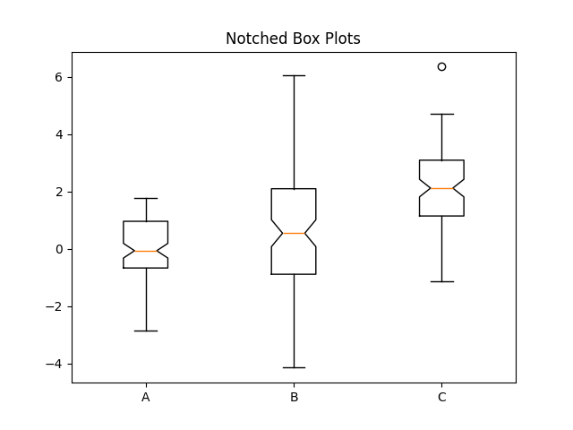
Coloured (Filled) Boxes
Use patch_artist=True and set boxprops or facecolor.
import matplotlib.pyplot as pltimport numpy as npdata1 = np.random.normal(0, 1, 100)data2 = np.random.normal(1, 2, 100)data3 = np.random.normal(2, 1.5, 100)colors = ['#99ccff', '#ff9999', '#99ff99']plt.boxplot( [data1, data2, data3], patch_artist=True, boxprops=dict(facecolor='lightblue', color='blue'), medianprops=dict(color='red'), labels=['A', 'B', 'C'])plt.title("Coloured Box Plots")plt.show()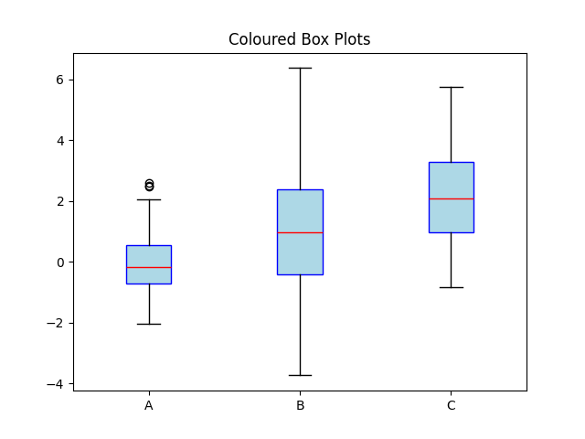
Or color each box differently:
import matplotlib.pyplot as pltimport numpy as npdata1 = np.random.normal(0, 1, 100)data2 = np.random.normal(1, 2, 100)data3 = np.random.normal(2, 1.5, 100)colors = ['#99ccff', '#ff9999', '#99ff99']boxes = plt.boxplot([data1, data2, data3], patch_artist=True)for patch, color in zip(boxes['boxes'], colors): patch.set_facecolor(color)plt.show()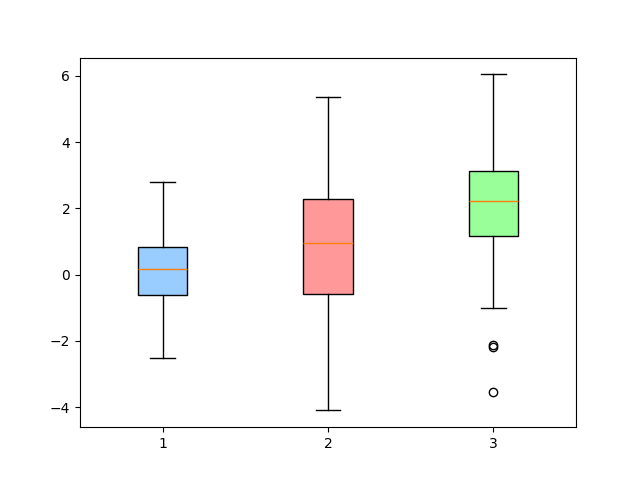
Show mean and mean line
import matplotlib.pyplot as pltimport numpy as npdata1 = np.random.normal(0, 1, 100)data2 = np.random.normal(1, 2, 100)data3 = np.random.normal(2, 1.5, 100)plt.boxplot( [data1, data2, data3], showmeans=True, meanline=True, labels=['A', 'B', 'C'])plt.title("Box Plot with Mean Line")plt.show()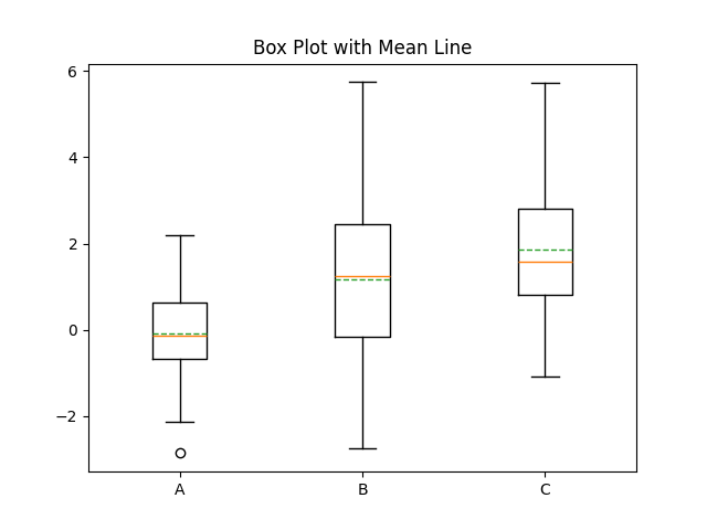
Adjust box widths
import matplotlib.pyplot as pltimport numpy as npdata1 = np.random.normal(0, 1, 100)data2 = np.random.normal(1, 2, 100)data3 = np.random.normal(2, 1.5, 100)plt.boxplot([data1, data2, data3], widths=0.5, labels=['A', 'B', 'C'])plt.title("Custom Box Widths")plt.show()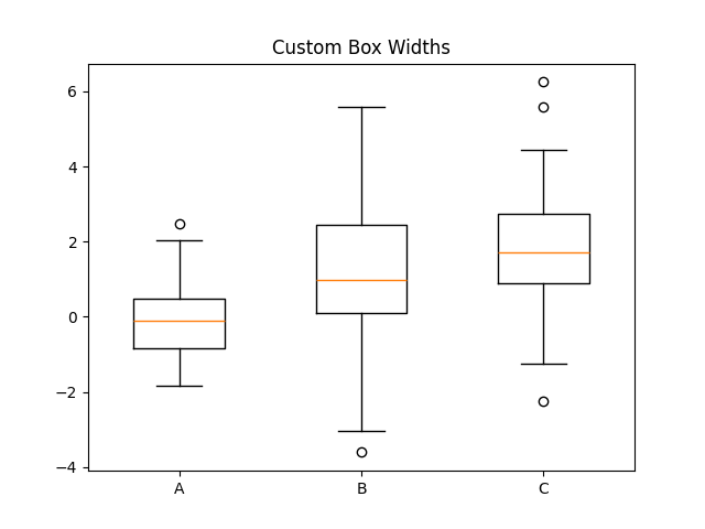
Customise outliers
import matplotlib.pyplot as pltimport numpy as npdata1 = np.random.normal(0, 1, 100)data2 = np.random.normal(1, 2, 100)data3 = np.random.normal(2, 1.5, 100)plt.boxplot( [data1, data2, data3], flierprops=dict(marker='o', markerfacecolor='red', markersize=6, linestyle='none'), labels=['A', 'B', 'C'])plt.title("Custom Outlier Markers")plt.show()
Display data points on top of box plot
Combine with plt.scatter() or plt.plot() for more detail.
import matplotlib.pyplot as pltimport numpy as npdata = np.random.randn(100)plt.boxplot(data)plt.scatter(np.random.normal(1, 0.04, size=len(data)), data, alpha=0.5)plt.title("Box Plot with Raw Data Overlay")plt.show()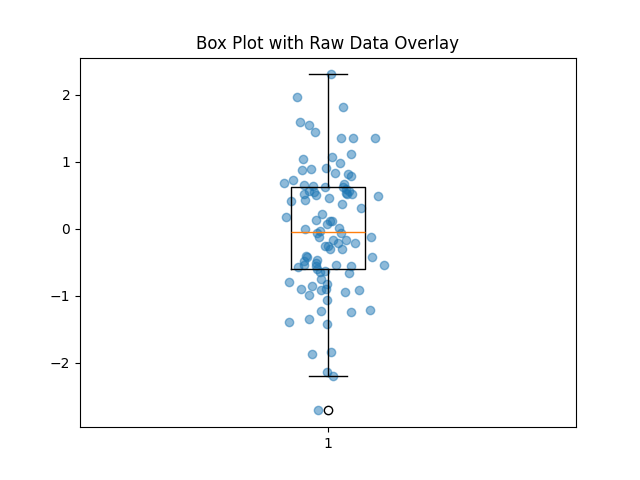
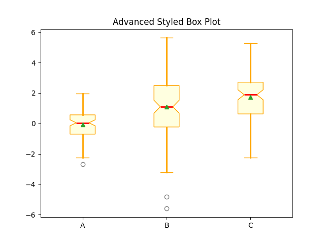
Advanced styling example
import matplotlib.pyplot as pltimport numpy as npdata1 = np.random.normal(0, 1, 100)data2 = np.random.normal(1, 2, 100)data3 = np.random.normal(2, 1.5, 100)plt.boxplot( [data1, data2, data3], patch_artist=True, notch=True, showmeans=True, meanline=False, boxprops=dict(facecolor='lightyellow', color='orange'), whiskerprops=dict(color='orange', linewidth=2), medianprops=dict(color='red', linewidth=2), capprops=dict(color='orange'), flierprops=dict(marker='o', color='black', alpha=0.5), labels=['A', 'B', 'C'])plt.title("Advanced Styled Box Plot")plt.show()