Layouts and multiple charts
Matplotlib Basics
2 min read
Published Oct 5 2025, updated Aug 17 2026
Guide Sections
Guide Comments
Matplotlib gives you several flexible ways to arrange multiple charts (axes) in a single figure.
Key Concepts:
Figure= The overall canvas or page where all plots liveAxes= A single plot area (with x/y axes, labels, etc.)Subplot= A single Axes positioned within a grid inside the FigureLayout= How those Axes are arranged (rows × columns)
A single figure can contain multiple axes in a grid layout or even precisely positioned with gridspec.
The Three Main Approaches:
Method | When to use | Description |
plt.subplot() | Simple, small grids | Quick creation (old style) |
plt.subplots() | Modern and flexible | Preferred for most uses |
GridSpec | Complex / unequal layouts | Fine control of positioning |
Quick & simple — plt.subplot()
plt.subplot(nrows, ncols, index) Creates one subplot in a grid:
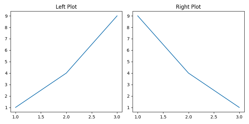
import matplotlib.pyplot as pltplt.figure(figsize=(8, 4))# 1st plotplt.subplot(1, 2, 1)plt.plot([1, 2, 3], [1, 4, 9])plt.title("Left Plot")# 2nd plotplt.subplot(1, 2, 2)plt.plot([1, 2, 3], [9, 4, 1])plt.title("Right Plot")plt.tight_layout()plt.show()Quick but limited — you have to call it before each plot.
Modern & preferred — plt.subplots()
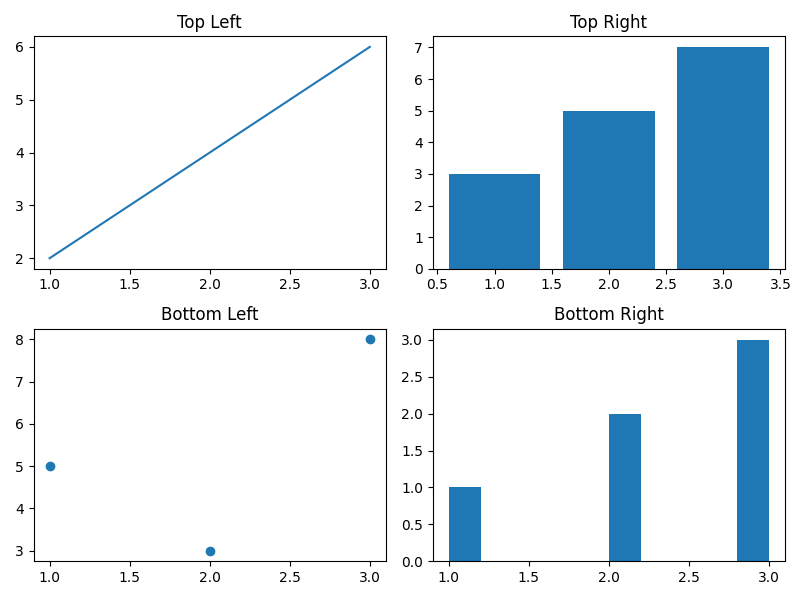
This returns both a figure and axes objects, letting you manage everything cleanly:
import matplotlib.pyplot as pltfig, axes = plt.subplots(2, 2, figsize=(8, 6))axes[0, 0].plot([1, 2, 3], [2, 4, 6])axes[0, 0].set_title("Top Left")axes[0, 1].bar([1, 2, 3], [3, 5, 7])axes[0, 1].set_title("Top Right")axes[1, 0].scatter([1, 2, 3], [5, 3, 8])axes[1, 0].set_title("Bottom Left")axes[1, 1].hist([1, 2, 2, 3, 3, 3])axes[1, 1].set_title("Bottom Right")plt.tight_layout()plt.show()axes is a NumPy array — index as [row, column].
1D layouts — row or column only
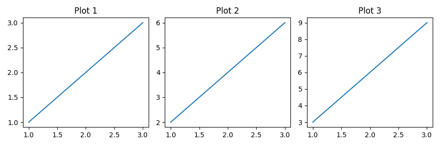
If you only have one row or column, axes becomes 1D:
import matplotlib.pyplot as pltfig, axes = plt.subplots(1, 3, figsize=(9, 3))for i, ax in enumerate(axes): ax.plot([1, 2, 3], [j * (i+1) for j in [1, 2, 3]]) ax.set_title(f"Plot {i+1}")plt.tight_layout()plt.show()Access as axes[0], axes[1], etc.
Shared axes
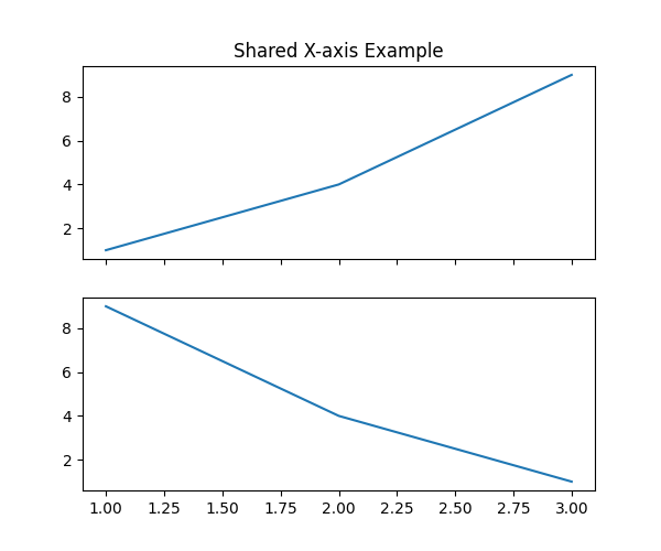
You can make subplots share an axis scale:
import matplotlib.pyplot as pltfig, axes = plt.subplots(2, 1, sharex=True, figsize=(6, 5))axes[0].plot([1, 2, 3], [1, 4, 9])axes[1].plot([1, 2, 3], [9, 4, 1])axes[0].set_title("Shared X-axis Example")plt.show()sharex=True or sharey=True
Adjusting spacing between Subplots
plt.subplots_adjust(left=0.1, right=0.95, top=0.9, bottom=0.1, wspace=0.3, hspace=0.4)or simply:
plt.tight_layout(pad=2.0)tight_layout() automatically fits titles and labels neatly.
Unequal layouts — GridSpec
Use matplotlib.gridspec for non-uniform layouts:
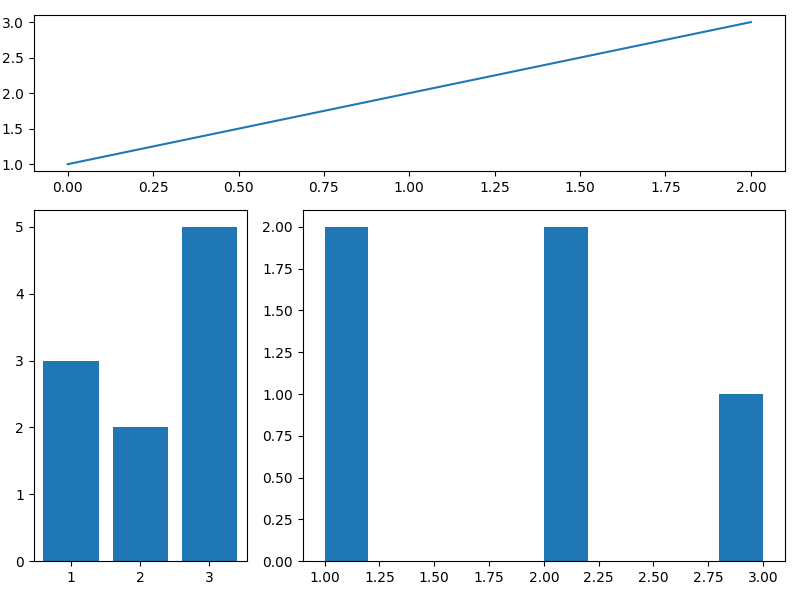
import matplotlib.pyplot as pltimport matplotlib.gridspec as gridspecfig = plt.figure(figsize=(8, 6))gs = gridspec.GridSpec(3, 3)# top spans all columnsax1 = fig.add_subplot(gs[0, :])# bottom-leftax2 = fig.add_subplot(gs[1:, 0]) # bottom-right 2×2ax3 = fig.add_subplot(gs[1:, 1:]) ax1.plot([1, 2, 3])ax2.bar([1, 2, 3], [3, 2, 5])ax3.hist([1, 2, 3, 2, 1])plt.tight_layout()plt.show()Very flexible — choose cell ranges like [row_start:row_end, col_start:col_end].
Mixed plot types
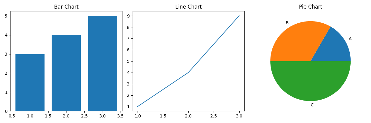
You can mix bar, line, scatter, pie, etc., in one figure:
import matplotlib.pyplot as pltfig, axs = plt.subplots(1, 3, figsize=(12, 4))axs[0].bar([1,2,3], [3,4,5])axs[0].set_title("Bar Chart")axs[1].plot([1,2,3], [1,4,9])axs[1].set_title("Line Chart")axs[2].pie([10,20,30], labels=['A','B','C'])axs[2].set_title("Pie Chart")plt.tight_layout()plt.show()Each Axes object acts independently.
Compact multi-chart using plt.subplot_mosaic
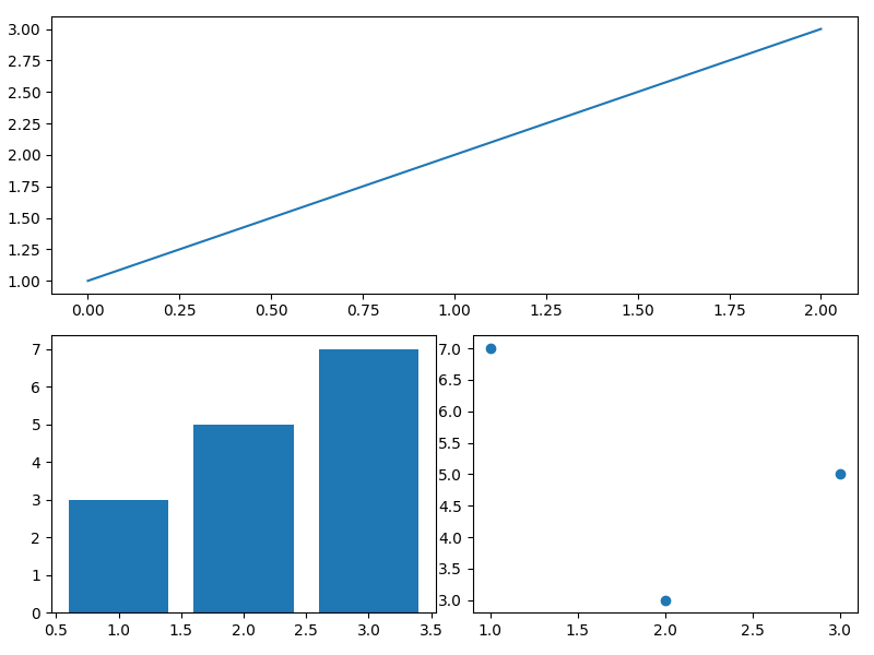
A more readable layout system:
import matplotlib.pyplot as pltfig, ax = plt.subplot_mosaic( [['top', 'top'], ['bottom_left', 'bottom_right']], figsize=(8, 6))ax['top'].plot([1,2,3])ax['bottom_left'].bar([1,2,3], [3,5,7])ax['bottom_right'].scatter([1,2,3], [7,3,5])plt.tight_layout()plt.show()- To tell Matplotlib that
"top"spans both columns, repeat the key name in the list. - You can reference axes by name, not index — great for complex layouts.
Dashboard style layout
import matplotlib.pyplot as pltfig = plt.figure(constrained_layout=True, figsize=(10, 6))gs = fig.add_gridspec(2, 3)ax1 = fig.add_subplot(gs[0, 0])ax2 = fig.add_subplot(gs[0, 1])ax3 = fig.add_subplot(gs[0, 2])ax4 = fig.add_subplot(gs[1, :])ax1.bar([1,2,3], [3,4,5])ax2.plot([1,2,3], [5,3,6])ax3.pie([30,40,30], labels=['A','B','C'])ax4.hist([1,1,2,2,3,3,3])plt.suptitle("Multi-Chart Dashboard", fontsize=16)plt.show()constrained_layout=True automatically optimizes spacing between subplots.
