Scatter plots
Matplotlib Basics
1 min read
This section is 1 min read, full guide is 24 min read
Published Oct 5 2025
15
Show sections list
0
Log in to enable the "Like" button
0
Guide comments
0
Log in to enable the "Save" button
Respond to this guide
Guide Sections
Guide Comments
ChartsGraphsMatplotlibNumPyPandasPythonVisualisation
A scatter plot displays data as points, each representing a pair of x–y coordinates. It’s used to visualise correlations, patterns, and outliers.
Syntax:
plt.scatter(x, y, s=None, c=None, marker=None, cmap=None, alpha=None, edgecolors=None, linewidths=None)
Copy to Clipboard
Parameters:
x,y= coordinates of pointss= size of each marker (scalar or list)c= colour(s) of each marker (scalar, list, or colormap)marker= shape of the pointcmap= colour map (used when c is numeric)alpha= transparency (0–1)edgecolors= outline colour of markerslinewidths= thickness of marker edges
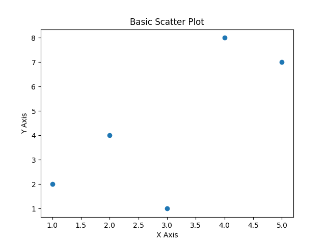
Basic example
import matplotlib.pyplot as plt
x = [1, 2, 3, 4, 5]
y = [2, 4, 1, 8, 7]
plt.scatter(x, y)
plt.title("Basic Scatter Plot")
plt.xlabel("X Axis")
plt.ylabel("Y Axis")
plt.show()
Copy to Clipboard
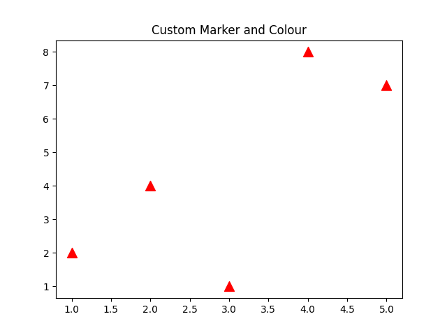
Marker style and colour
import matplotlib.pyplot as plt
x = [1, 2, 3, 4, 5]
y = [2, 4, 1, 8, 7]
plt.scatter(x, y, color='red', marker='^', s=100)
plt.title("Custom Marker and Colour")
plt.show()
Copy to Clipboard
Marker options:
Marker | Symbol | Description |
'o' | ○ | Circle |
's' | ■ | Square |
'^' | ▲ | Triangle up |
'v' | ▼ | Triangle down |
'*' | ✱ | Star |
'D' | ◆ | Diamond |
'x' | ✕ | Cross |
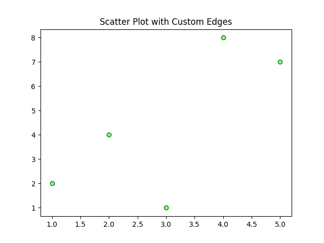
Custom edges
import matplotlib.pyplot as plt
x = [1, 2, 3, 4, 5]
y = [2, 4, 1, 8, 7]
plt.scatter(x, y, color='lightgreen', edgecolor='green', linewidths=1)
plt.title("Scatter Plot with Custom Edges")
plt.show()
Copy to Clipboard
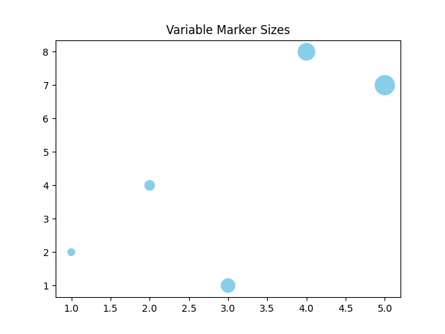
Variable marker sizes
import matplotlib.pyplot as plt
x = [1, 2, 3, 4, 5]
y = [2, 4, 1, 8, 7]
sizes = [50, 100, 200, 300, 400]
plt.scatter(x, y, s=sizes, color='skyblue')
plt.title("Variable Marker Sizes")
plt.show()
Copy to Clipboard
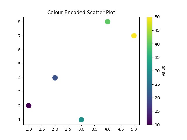
Variable Marker Colours (Colour Encoding)
import matplotlib.pyplot as plt
x = [1, 2, 3, 4, 5]
y = [2, 4, 1, 8, 7]
colours = [10, 20, 30, 40, 50]
plt.scatter(x, y, c=colours, cmap='viridis', s=150)
plt.colorbar(label='Value')
plt.title("Colour Encoded Scatter Plot")
plt.show()
Copy to Clipboard
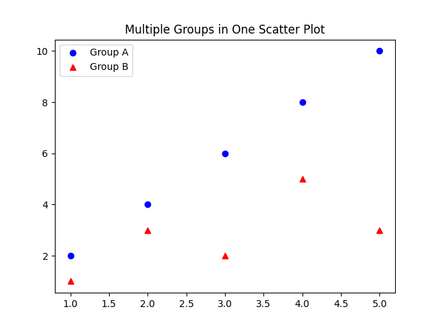
Multiple scatter groups (categorical comparison)
import matplotlib.pyplot as plt
x1 = [1, 2, 3, 4, 5]
y1 = [2, 4, 6, 8, 10]
x2 = [1, 2, 3, 4, 5]
y2 = [1, 3, 2, 5, 3]
plt.scatter(x1, y1, color='blue', label='Group A', marker='o')
plt.scatter(x2, y2, color='red', label='Group B', marker='^')
plt.legend()
plt.title("Multiple Groups in One Scatter Plot")
plt.show()
Copy to Clipboard
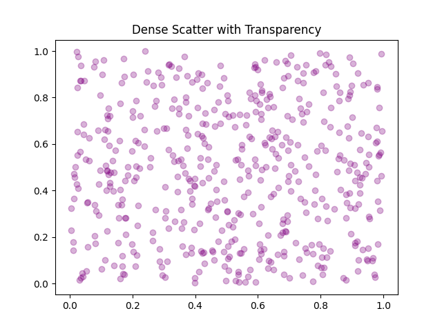
Using alpha and colormap for dense data
When you have many points, use transparency to make patterns visible:
import matplotlib.pyplot as plt
import numpy as np
x = np.random.rand(500)
y = np.random.rand(500)
plt.scatter(x, y, alpha=0.3, color='purple')
plt.title("Dense Scatter with Transparency")
plt.show()
Copy to Clipboard
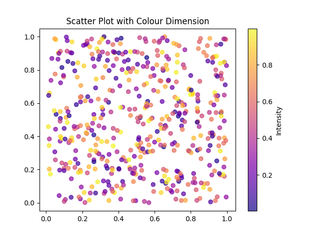
Or add colour coding based on a third variable:
import matplotlib.pyplot as plt
import numpy as np
x = np.random.rand(500)
y = np.random.rand(500)
z = np.random.rand(500)
plt.scatter(x, y, c=z, cmap='plasma', alpha=0.7)
plt.colorbar(label='Intensity')
plt.title("Scatter Plot with Colour Dimension")
plt.show()
Copy to Clipboard
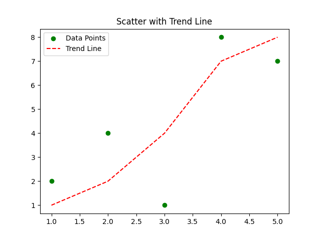
Scatter with line
You can combine scatter with other chart types or add reference lines.:
import matplotlib.pyplot as plt
import numpy as np
x = [1, 2, 3, 4, 5]
y = [2, 4, 1, 8, 7]
plt.scatter(x, y, color='green', label='Data Points')
plt.plot(sorted(x), sorted(y), 'r--', label='Trend Line')
plt.legend()
plt.title("Scatter with Trend Line")
plt.show()
Copy to Clipboard
Products from our shop
Docker Cheat Sheet - Print at Home Designs

Docker Cheat Sheet Mouse Mat

Docker Cheat Sheet Travel Mug

Docker Cheat Sheet Mug
Vim Cheat Sheet - Print at Home Designs

Vim Cheat Sheet Mouse Mat

Vim Cheat Sheet Travel Mug

Vim Cheat Sheet Mug

SimpleSteps.guide branded Travel Mug

Developer Excuse Javascript - Travel Mug

Developer Excuse Javascript Embroidered T-Shirt - Dark

Developer Excuse Javascript Embroidered T-Shirt - Light

Developer Excuse Javascript Mug - White

Developer Excuse Javascript Mug - Black

SimpleSteps.guide branded stainless steel water bottle

Developer Excuse Javascript Hoodie - Light
