Violin plots
Matplotlib Basics
2 min read
Published Oct 5 2025
Guide Sections
Guide Comments
A violin plot combines a box plot and a kernel density plot (KDE) — it shows:
- The distribution shape (density) of the data on each side.
- The median and interquartile range (like a box plot).
- Possible multiple datasets side by side.
It’s ideal for comparing data distributions and spread between groups.
Syntax:
Parameters:
dataset= Array-like data or list of datasetspositions= X-axis positions of violinsvert= Vertical (True) or horizontal (False)widths= Width of each violinshowmeans= Show mean markershowextrema= Show min/max barsshowmedians= Show median linebw_method= Controls smoothing of KDE (e.g., 'scott', 'silverman', or float)
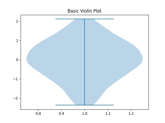
Basic violin plot example
Displays one violin — vertical, centred at x = 1.
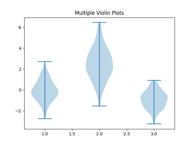
Multiple violin plots
Pass multiple datasets as a list (or 2D array):
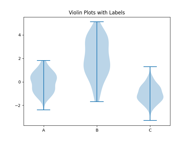
Add labels
By default, violin plots have no x-axis labels — you can add them manually:
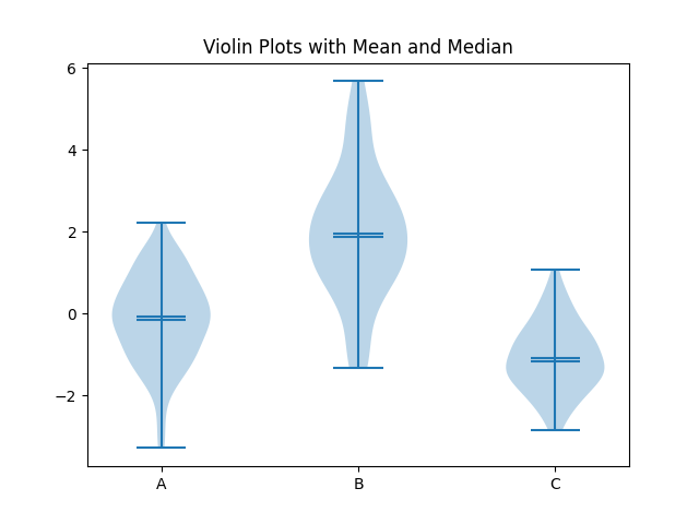
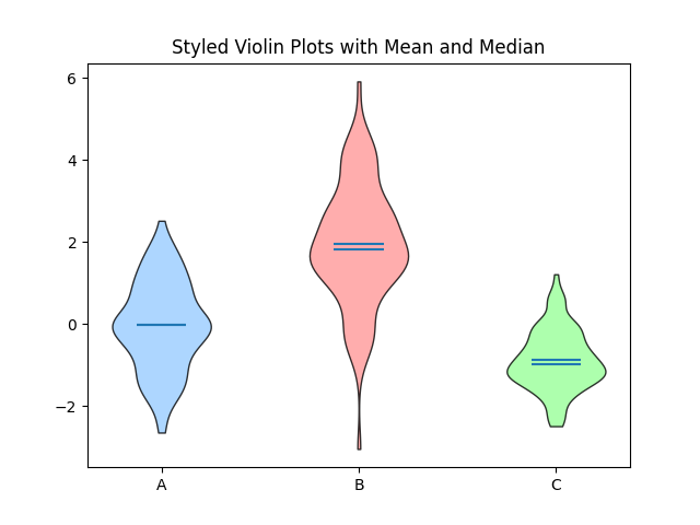
Show median, mean, and extremes
- Mean: typically a dot or horizontal line.
- Median: bold centre line.
- Extrema: thin top/bottom lines.
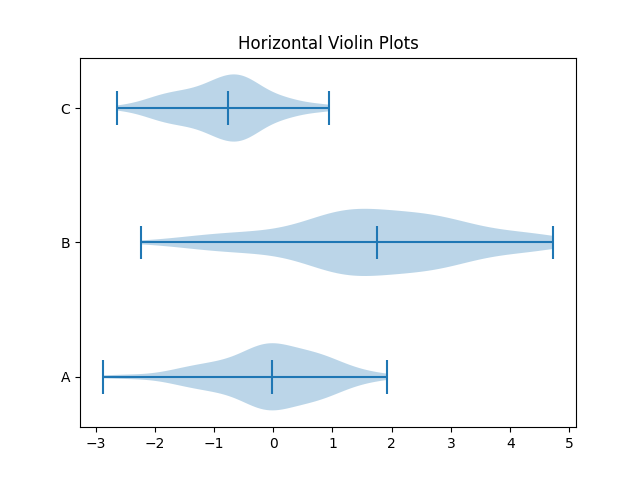
Horizontal violin plots
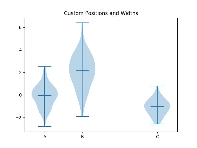
Adjust widths and positions
You can manually set the positions and relative widths of violins:
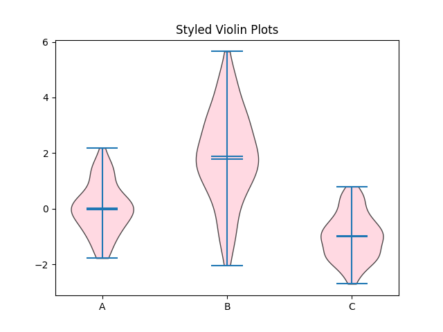
Customise appearance
The violinplot function returns a dictionary-like object with components (bodies, cmeans, cmedians, etc.), so you can modify their styles individually:
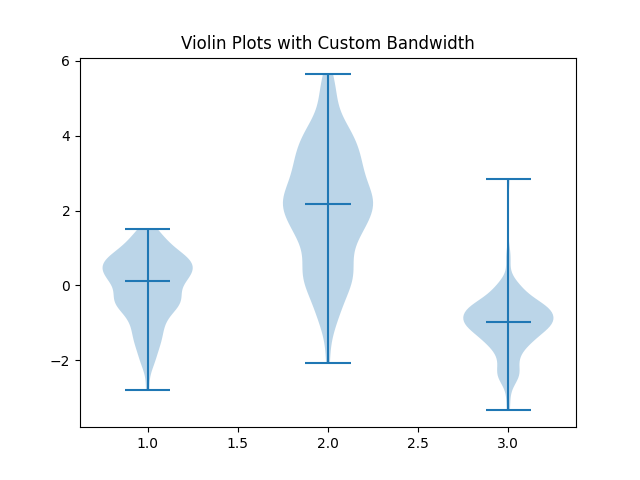
Change smoothing (bandwidth) of KDE
The bw_method parameter controls how smooth the violins are:
Smaller bw_method = more jagged, larger = smoother.
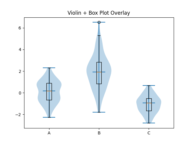
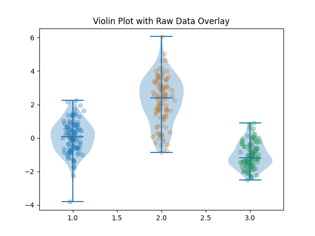
Overlay box plot or scatter points
You can combine violin plots with box plots or raw data points for more detail:
Or scatter points:
Full styled example
Products from our shop
Docker Cheat Sheet - Print at Home Designs

Docker Cheat Sheet Mouse Mat

Docker Cheat Sheet Travel Mug

Docker Cheat Sheet Mug
Vim Cheat Sheet - Print at Home Designs

Vim Cheat Sheet Mouse Mat

Vim Cheat Sheet Travel Mug

Vim Cheat Sheet Mug

SimpleSteps.guide branded Travel Mug

Developer Excuse Javascript - Travel Mug

Developer Excuse Javascript Embroidered T-Shirt - Dark

Developer Excuse Javascript Embroidered T-Shirt - Light

Developer Excuse Javascript Mug - White

Developer Excuse Javascript Mug - Black

SimpleSteps.guide branded stainless steel water bottle

Developer Excuse Javascript Hoodie - Light
