Building a dashboard
Quick ML: machine learning on your iPhone and iPad
3 min read
Published Sep 6 2026
Guide Sections
Guide Comments
A dashboard composes stat tiles, charts, model cards and text into a live report. It is a Pro feature, and the Dashboard row on the project screen is the only place it asks. Once you are in, nothing else is gated.
There is no create step
Tap Dashboard and you are looking at it. The record is created the first time you open the screen, so do not go hunting for a New Dashboard button. An empty dashboard shows a short instruction and a plus button.
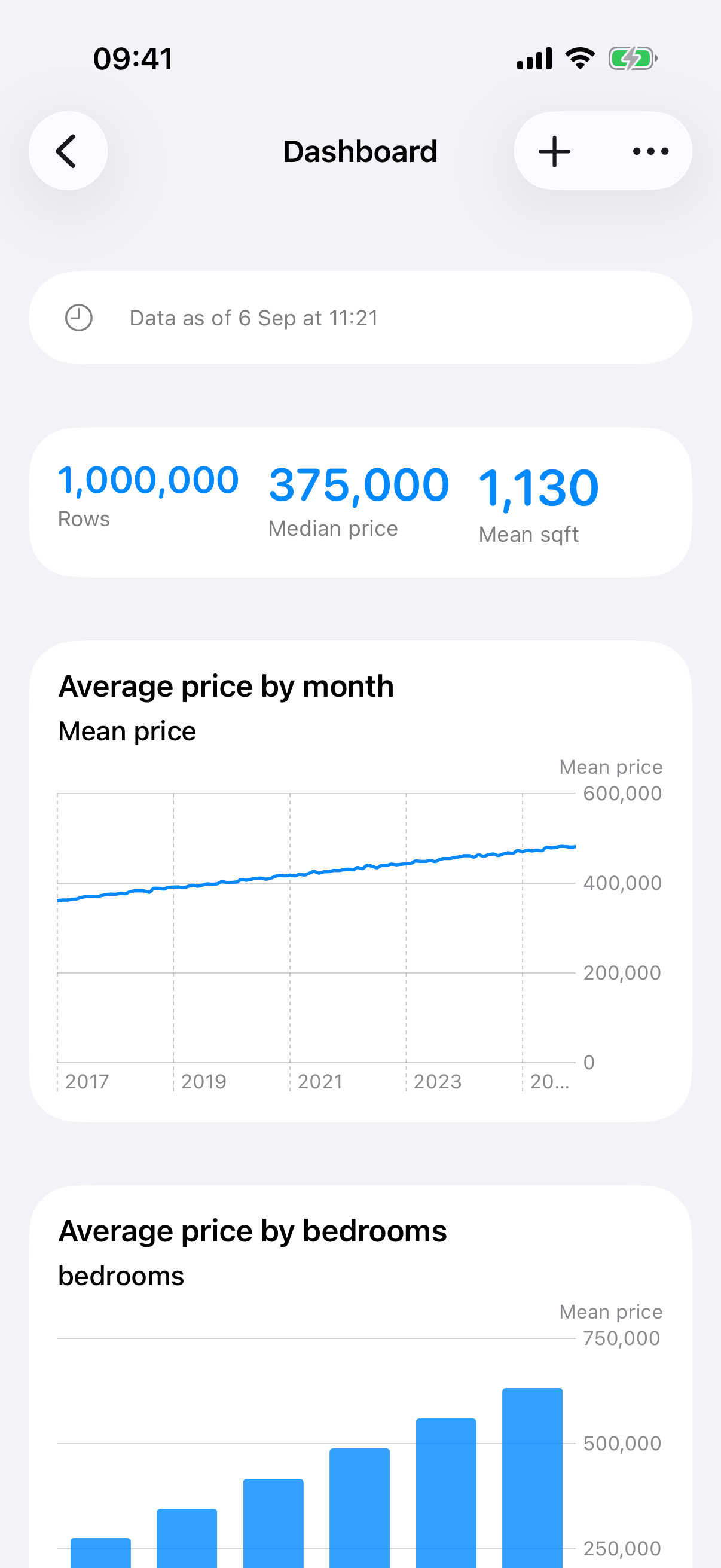
A dashboard: stat tiles and a time series.
Adding blocks
Tap Add Block and choose one of nine block types.
Block | What it shows |
Stat Tile | One number: row count, column count, a column's mean, median, minimum, maximum, sum, standard deviation, distinct count or missing count, or a model's headline metric |
Column Chart | A histogram for a numeric column or a bar chart of the top values for a category |
Pie Chart | Pie or donut of a column's top values, with the rest rolled into Other |
Distribution | Histogram, box or violin for a numeric column, with an optional group-by for boxes |
Grouped Bars | Count, mean or sum by category, optionally split by a second category, stacked or side by side |
Time Series | A line or area over a date column, bucketed by minute, hour, day, week, month or year |
Correlation Pair | A scatter of two numeric columns, optionally coloured by a category |
Model Card | A trained model's algorithm, target, metrics and training row count |
Text | Anything you want to write |
Every block takes an optional title, and every column picker starts with Choose so you cannot save a half-configured block. A stat tile can be given thresholds: a green value, a red value, and amber in between, with a direction so that "lower is better" tiles colour the right way round.
Rows and slots
Each block starts in a row of its own. Long-press a block and choose Slots in This Row to split the row into two or three slots and put blocks side by side, which is how you get a row of stat tiles across the top. Move Into Row Above does what it says, and Reorder Rows in the toolbar drags whole rows around. On a narrow screen, a row of charts stacks; a row of stat tiles or text stays side by side.
Live, honestly
Nothing numeric is stored in a dashboard. The composition is what syncs, and the numbers are recomputed from the local data every time the screen appears and every time you save a block. A strip at the top reads "Data as of" with the last refresh, and for a refreshable source there is a Refresh button right there.
The Time Series tile's Auto bucket picks minutes, hours, days or months from the span of the data, which exists because a Keep History dataset of snapshots taken minutes apart used to land in one day bucket and draw a single dot.
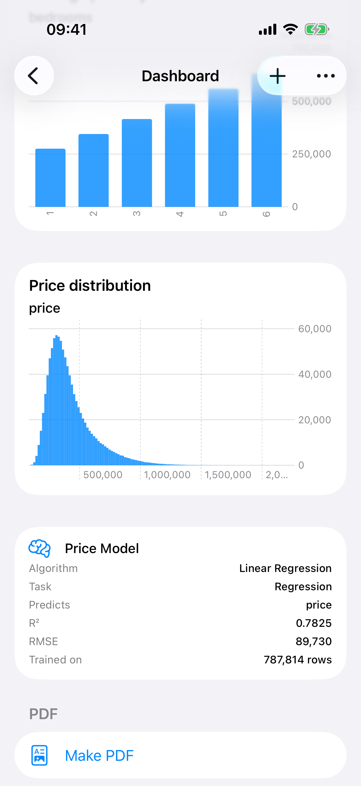
Further down the same dashboard: a distribution, a model card and Make PDF.
A paper copy
At the bottom, Make PDF renders the dashboard row by row into a document you can view, share or regenerate. It is separate from the project report in the next chapter, and every page is titled Dashboard.