Time-ordered models and the Forecast chart
Quick ML: machine learning on your iPhone and iPad
3 min read
Published Sep 6 2026
Guide Sections
Guide Comments
Let me be straight about this one, because the word forecast promises a lot. Quick ML does not extrapolate beyond your data. There is no "predict the next twelve months" button. What it has is the honest way of training and testing a model on data with a time in it, and a chart that shows how the model did on the stretch of time it never saw.
The time-ordered split
On the model setup screen, the Method control under Train / Test Split offers Random or Time-Ordered. Choose Time-Ordered, then pick your date column in the Order By picker. The model trains on the earliest rows and is tested on the latest.
This matters. A random split on time series data leaks the future into training, because the model sees rows from next week while learning to predict this one. The score looks wonderful and means nothing. A time-ordered split gives the model the same disadvantage it will have in real life.
Date columns are never features themselves. To let the model see time, derive year, month, season or day of week from the date in the column explorer, and add lag and rolling columns to give it the recent past.
The Forecast chart
A regression model trained with a time-ordered split gets a Forecast section on its page. Tap Show Forecast Chart and you get actuals as a solid line and the model's predictions as a dashed one, running along your date column, with a marker where the held-out segment begins. Everything to the right of the marker is the future the model never saw during training.
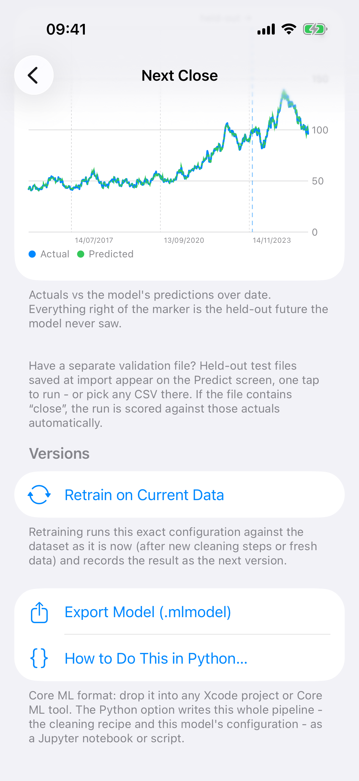
The Forecast chart. Everything right of the dashed line is the held-out future.
If the two lines track each other past the marker, the model has learnt something that held up. If they part company, you have learnt something too. Either way it is a backtest, and the footer describes it in the past tense on purpose.
Where the time series comes from
You need a date column and enough rows along it. Three routes:
- Your data already has one. Daily prices, monthly sales, sensor readings.
- Keep History, from the refreshing chapter, turns a page that only ever shows the present into a series by stamping every refresh. Refresh is Pro, but the chart is not.
- Tidy Dates in the cleaning menu, if your dates are in a mixed format and the app read the column as text.
Auto-Tune, for Pro users, notices the time-ordered split and switches its cross-validation to an expanding window, so each fold trains only on blocks before it and the tuning never peeks ahead either.
Related pieces
The Time Series dashboard tile draws a date column by minute, hour, day, week, month or year. Lag and rolling columns in the column explorer let a model see the previous value or the mean of the last few. And the Python notebook describes the split in one line I rather like: train on the past, test on the future, the honest way to evaluate forecasting.