Bar plots
Seaborn basics
2 min read
This section is 2 min read, full guide is 42 min read
Published Oct 7 2025
24
Show sections list
0
Log in to enable the "Like" button
0
Guide comments
0
Log in to enable the "Save" button
Respond to this guide
Guide Sections
Guide Comments
ChartsGraphsMatplotlibNumPyPandasPythonSeabornVisualisation
seaborn.barplot() is used to visualise the mean (or another aggregate) of a numerical variable for different categories.
It automatically computes and plots:
- The central tendency (by default, the mean) of each category
- Error bars showing uncertainty (by default, the 95% confidence interval)
In other words:
Each bar shows the average of
yfor each category ofx.
Syntax:
sns.barplot(
data=None,
x=None,
y=None,
hue=None,
estimator='mean',
ci='auto',
palette=None,
order=None,
hue_order=None,
orient=None,
errorbar=('ci', 95),
width=0.8,
dodge=True,
**kwargs
)
Copy to Clipboard
Parameters:
data= DataFrame with datax,y= Variables for categories (x) and values (y)hue= Adds subcategories (grouped bars)estimator= Function for aggregation (default = mean)ci/errorbar= Confidence interval or error bars (None, 'sd', 'ci', or numeric)palette= Colour paletteorder/hue_order= Specify order of categoriesorient= "v" (vertical) or "h" (horizontal)width= Bar widthdodge= Separate bars for hue categories (True/False)
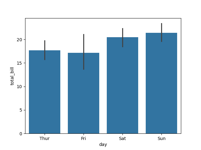
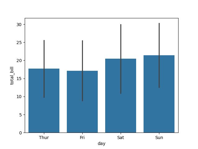
Basic example
import seaborn as sns
import matplotlib.pyplot as plt
tips = sns.load_dataset("tips")
sns.barplot(data=tips, x="day", y="total_bill")
plt.show()
Copy to Clipboard
This shows the average total bill for each day of the week.
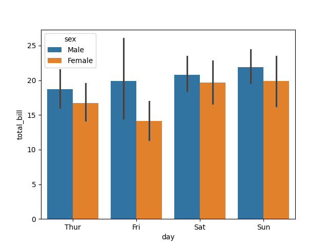
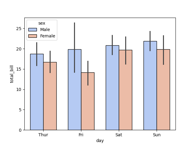
Add hue (subgroups)
import seaborn as sns
import matplotlib.pyplot as plt
tips = sns.load_dataset("tips")
sns.barplot(data=tips, x="day", y="total_bill", hue="sex")
plt.show()
Copy to Clipboard
- Each day shows two bars, one for each sex.
- Bars are placed side by side (because
dodge=Trueby default).
Change estimator (aggregation function)
import seaborn as sns
import matplotlib.pyplot as plt
import numpy as np
tips = sns.load_dataset("tips")
sns.barplot(data=tips, x="day", y="total_bill", estimator=np.median)
plt.show()
Copy to Clipboard
Now, each bar shows the median total bill per day instead of the mean.
Customise error bars
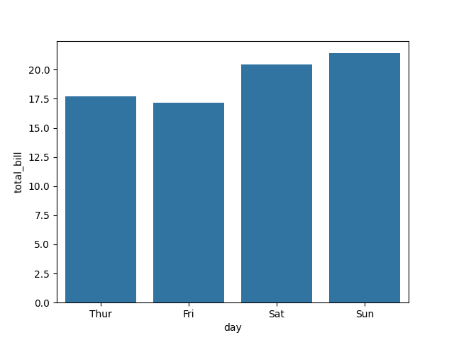
Remove error bars:
import seaborn as sns
import matplotlib.pyplot as plt
tips = sns.load_dataset("tips")
sns.barplot(data=tips, x="day", y="total_bill", ci=None)
plt.show()
Copy to Clipboard
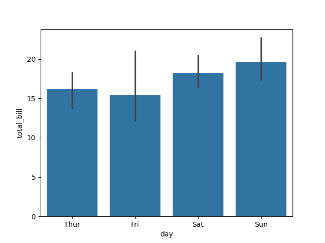
Or show standard deviation:
import seaborn as sns
import matplotlib.pyplot as plt
tips = sns.load_dataset("tips")
sns.barplot(data=tips, x="day", y="total_bill", errorbar='sd')
plt.show()
Copy to Clipboard
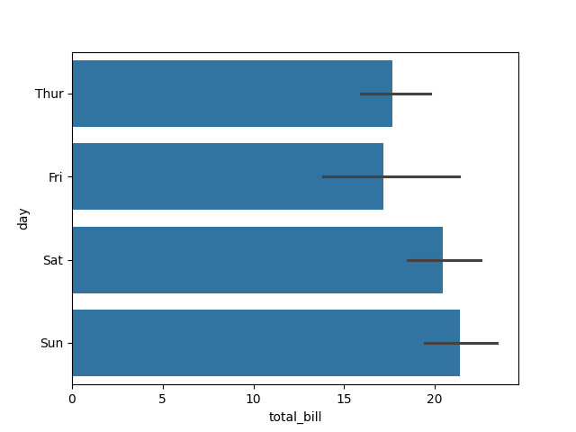
Horizontal bars
import seaborn as sns
import matplotlib.pyplot as plt
tips = sns.load_dataset("tips")
sns.barplot(data=tips, x="total_bill", y="day", orient="h")
plt.show()
Copy to Clipboard
Simply swap x and y and set orient="h" to flip orientation.
Customise colours and style
import seaborn as sns
import matplotlib.pyplot as plt
tips = sns.load_dataset("tips")
sns.barplot(
data=tips,
x="day",
y="total_bill",
hue="sex",
palette="coolwarm",
edgecolor="black",
width=0.7
)
plt.show()
Copy to Clipboard
palette="coolwarm"→ colourful gradientedgecolor="black"→ outline barswidth=0.7→ slightly thinner bars
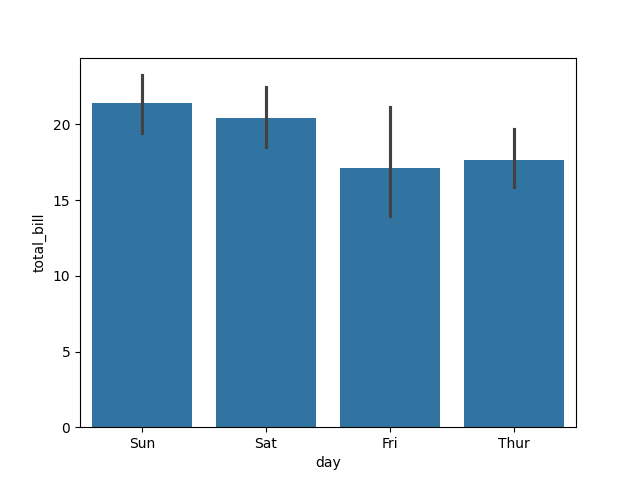
Control category order
import seaborn as sns
import matplotlib.pyplot as plt
tips = sns.load_dataset("tips")
sns.barplot(
data=tips,
x="day",
y="total_bill",
order=["Sun", "Sat", "Fri", "Thur"]
)
plt.show()
Copy to Clipboard
Controls the order of categories on the x-axis.
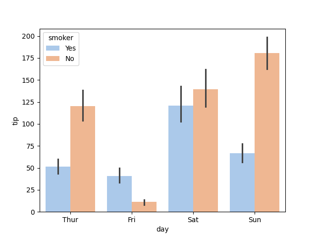
Combine with hue and estimator
import seaborn as sns
import matplotlib.pyplot as plt
tips = sns.load_dataset("tips")
sns.barplot(
data=tips,
x="day",
y="tip",
hue="smoker",
estimator=sum,
palette="pastel"
)
plt.show()
Copy to Clipboard
Bars now show the total tips (not average) by day and smoker status.
Products from our shop
Docker Cheat Sheet - Print at Home Designs

Docker Cheat Sheet Mouse Mat

Docker Cheat Sheet Travel Mug

Docker Cheat Sheet Mug
Vim Cheat Sheet - Print at Home Designs

Vim Cheat Sheet Mouse Mat

Vim Cheat Sheet Travel Mug

Vim Cheat Sheet Mug

SimpleSteps.guide branded Travel Mug

Developer Excuse Javascript - Travel Mug

Developer Excuse Javascript Embroidered T-Shirt - Dark

Developer Excuse Javascript Embroidered T-Shirt - Light

Developer Excuse Javascript Mug - White

Developer Excuse Javascript Mug - Black

SimpleSteps.guide branded stainless steel water bottle

Developer Excuse Javascript Hoodie - Light
