Box plots
Seaborn basics
2 min read
This section is 2 min read, full guide is 42 min read
Published Oct 7 2025
24
Show sections list
0
Log in to enable the "Like" button
0
Guide comments
0
Log in to enable the "Save" button
Respond to this guide
Guide Sections
Guide Comments
ChartsGraphsMatplotlibNumPyPandasPythonSeabornVisualisation
seaborn.boxplot() is used to visualise the distribution of a numerical variable and compare it across categories.
A box plot (a.k.a. box-and-whisker plot) shows:
- The median (middle value)
- The quartiles (Q1, Q3) — 25th and 75th percentiles
- The interquartile range (IQR) — Q3 − Q1
- Whiskers — roughly 1.5×IQR beyond the box
- Outliers — data points outside whiskers
It’s great for spotting spread, symmetry, and outliers in your data.
Syntax:
sns.boxplot(
data=None,
x=None,
y=None,
hue=None,
order=None,
hue_order=None,
orient=None,
color=None,
palette=None,
width=0.8,
dodge=True,
showcaps=True,
boxprops=None,
whiskerprops=None,
flierprops=None,
medianprops=None,
notch=False,
**kwargs
)
Copy to Clipboard
Parameters:
data= DataFrame containing the datax,y= Variables for categories and valueshue= Adds subcategories (side-by-side boxes)order/hue_order= Specify category orderpalette= Colour schemeorient= "v" (vertical) or "h" (horizontal)width= Width of boxesdodge= Separate hue boxes side by sidenotch= Draw notches to show confidence around medianflierprops= Customise outlier pointsmedianprops= Customise median line style
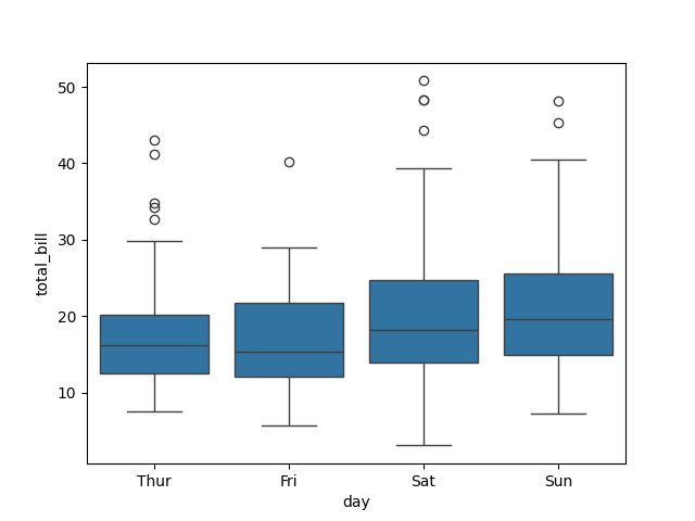
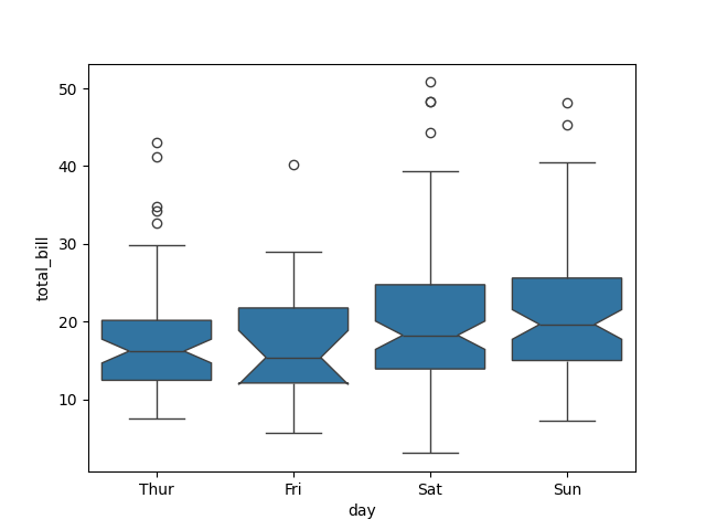
Basic example
import seaborn as sns
import matplotlib.pyplot as plt
tips = sns.load_dataset("tips")
sns.boxplot(data=tips, x="day", y="total_bill")
plt.show()
Copy to Clipboard
Shows the distribution of total bills for each day.
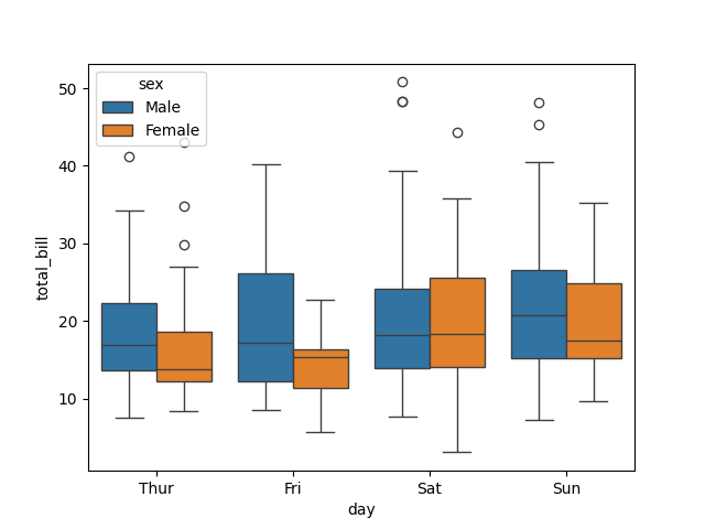
Add hue (subgroups)
import seaborn as sns
import matplotlib.pyplot as plt
tips = sns.load_dataset("tips")
sns.boxplot(data=tips, x="day", y="total_bill", hue="sex")
plt.show()
Copy to Clipboard
- Each day has two boxes, one per sex.
- Allows you to compare distributions between men and women for each day.
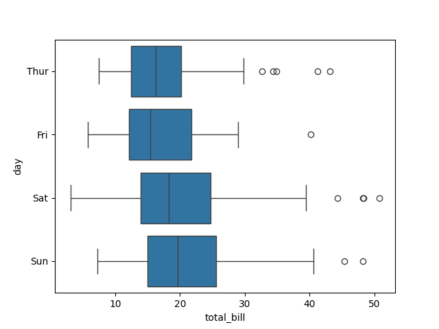
Horizontal boxes
import seaborn as sns
import matplotlib.pyplot as plt
tips = sns.load_dataset("tips")
sns.boxplot(data=tips, x="total_bill", y="day", orient="h")
plt.show()
Copy to Clipboard
Flips the boxes horizontally — good for long category labels.
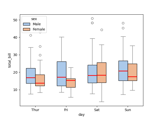
Customise colors and style
import seaborn as sns
import matplotlib.pyplot as plt
tips = sns.load_dataset("tips")
sns.boxplot(
data=tips,
x="day",
y="total_bill",
hue="sex",
palette="pastel",
width=0.6,
boxprops={"edgecolor": "black"},
medianprops={"color": "red", "linewidth": 2}
)
plt.show()
Copy to Clipboard
palette="pastel"→ soft colour thememedianprops→ style the median lineboxprops→ outline colour
Show or hide outliers
import seaborn as sns
import matplotlib.pyplot as plt
tips = sns.load_dataset("tips")
sns.boxplot(data=tips, x="day", y="total_bill", showfliers=False)
plt.show()
Copy to Clipboard
Removes outlier points (dots beyond whiskers).

Add notches for median confidence
import seaborn as sns
import matplotlib.pyplot as plt
tips = sns.load_dataset("tips")
sns.boxplot(data=tips, x="day", y="total_bill", notch=True)
plt.show()
Copy to Clipboard
Adds notches to indicate an approximate 95% confidence interval around the median.
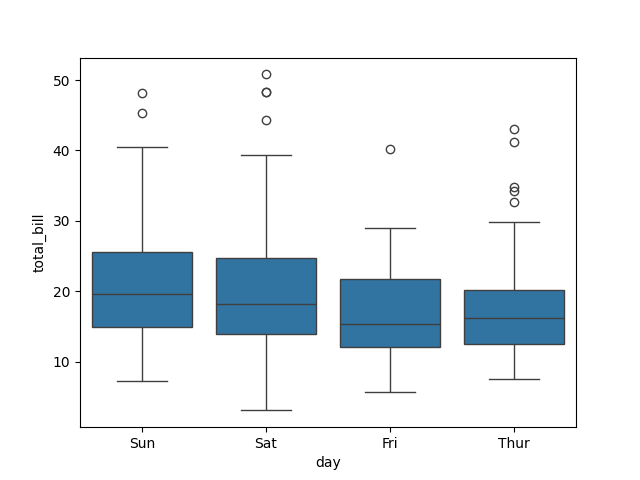
Control category order
import seaborn as sns
import matplotlib.pyplot as plt
tips = sns.load_dataset("tips")
sns.boxplot(
data=tips,
x="day",
y="total_bill",
order=["Sun", "Sat", "Fri", "Thur"]
)
plt.show()
Copy to Clipboard
Controls the order of categories on the x-axis.
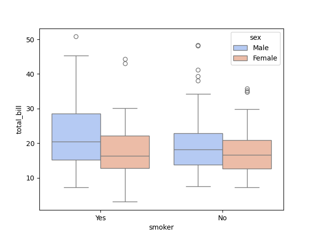
Using hue for subgroups
import seaborn as sns
import matplotlib.pyplot as plt
tips = sns.load_dataset("tips")
sns.boxplot(
data=tips,
x="smoker",
y="total_bill",
hue="sex",
palette="coolwarm"
)
plt.show()
Copy to Clipboard
Compares distributions of total bill across smokers/non-smokers for each sex.
Products from our shop
Docker Cheat Sheet - Print at Home Designs

Docker Cheat Sheet Mouse Mat

Docker Cheat Sheet Travel Mug

Docker Cheat Sheet Mug
Vim Cheat Sheet - Print at Home Designs

Vim Cheat Sheet Mouse Mat

Vim Cheat Sheet Travel Mug

Vim Cheat Sheet Mug

SimpleSteps.guide branded Travel Mug

Developer Excuse Javascript - Travel Mug

Developer Excuse Javascript Embroidered T-Shirt - Dark

Developer Excuse Javascript Embroidered T-Shirt - Light

Developer Excuse Javascript Mug - White

Developer Excuse Javascript Mug - Black

SimpleSteps.guide branded stainless steel water bottle

Developer Excuse Javascript Hoodie - Light
