Count plots
Seaborn basics
1 min read
This section is 1 min read, full guide is 42 min read
Published Oct 7 2025
24
Show sections list
0
Log in to enable the "Like" button
0
Guide comments
0
Log in to enable the "Save" button
Respond to this guide
Guide Sections
Guide Comments
ChartsGraphsMatplotlibNumPyPandasPythonSeabornVisualisation
seaborn.countplot() is used to count the number of occurrences of each category in a variable and display those counts as bars.
It’s basically like a barplot of counts, except you don’t need to compute the counts yourself — Seaborn does it automatically.
Syntax:
sns.countplot(
data=None,
x=None,
y=None,
hue=None,
order=None,
hue_order=None,
palette=None,
orient=None,
dodge=True,
width=0.8,
**kwargs
)
Copy to Clipboard
Parameters:
data= DataFrame containing the datax,y= Variable(s) for categories (only one is usually needed)hue= Adds subcategories (grouped bars)order/hue_order= Order of categories/subcategoriespalette= Colour paletteorient= "v" (vertical) or "h" (horizontal)dodge= Separate hue bars side by side (default: True)width= Bar width
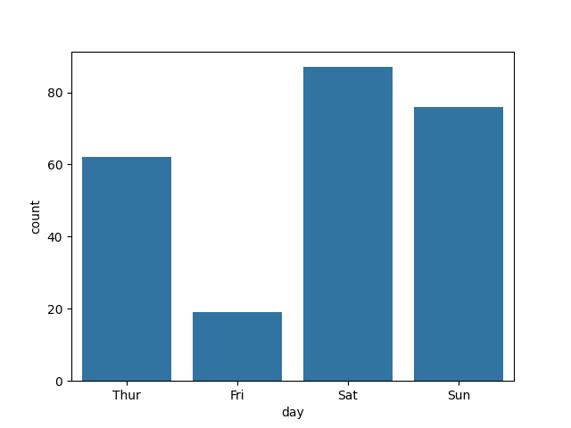
Basic example
import seaborn as sns
import matplotlib.pyplot as plt
tips = sns.load_dataset("tips")
sns.countplot(data=tips, x="day")
plt.show()
Copy to Clipboard
This shows how many records (meals) occurred on each day of the week.
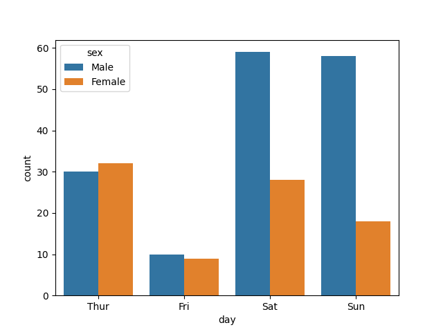
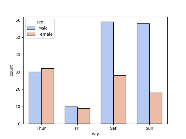
Add hue (subgroups)
import seaborn as sns
import matplotlib.pyplot as plt
tips = sns.load_dataset("tips")
sns.countplot(data=tips, x="day", hue="sex")
plt.show()
Copy to Clipboard
- Bars are split by sex.
- Each day shows two bars — one for each group in
sex.
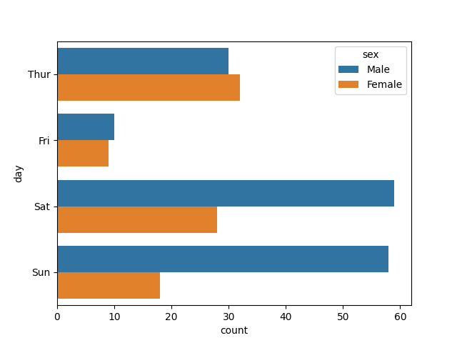
Horizontal bars
import seaborn as sns
import matplotlib.pyplot as plt
tips = sns.load_dataset("tips")
sns.countplot(data=tips, y="day", hue="sex", orient="h")
plt.show()
Copy to Clipboard
Flips the bars horizontally — helpful for long category names.
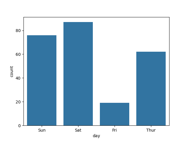
Specify category order
import seaborn as sns
import matplotlib.pyplot as plt
tips = sns.load_dataset("tips")
sns.countplot(
data=tips,
x="day",
order=["Sun", "Sat", "Fri", "Thur"]
)
plt.show()
Copy to Clipboard
Controls the order of bars along the x-axis.
Customise colours and style
import seaborn as sns
import matplotlib.pyplot as plt
tips = sns.load_dataset("tips")
sns.countplot(
data=tips,
x="day",
hue="sex",
palette="coolwarm",
edgecolor="black",
width=0.7
)
plt.show()
Copy to Clipboard
palette="coolwarm"→ colourful schemeedgecolor="black"→ outlines barswidth=0.7→ slightly thinner bars
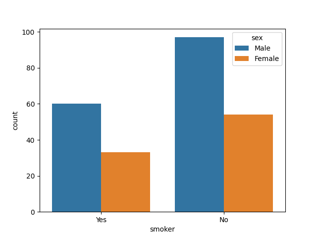
Count of multiple variables (via hue)
import seaborn as sns
import matplotlib.pyplot as plt
tips = sns.load_dataset("tips")
sns.countplot(data=tips, x="smoker", hue="sex")
plt.show()
Copy to Clipboard
Shows how many male vs. female smokers and non-smokers there are.
Products from our shop
Docker Cheat Sheet - Print at Home Designs

Docker Cheat Sheet Mouse Mat

Docker Cheat Sheet Travel Mug

Docker Cheat Sheet Mug
Vim Cheat Sheet - Print at Home Designs

Vim Cheat Sheet Mouse Mat

Vim Cheat Sheet Travel Mug

Vim Cheat Sheet Mug

SimpleSteps.guide branded Travel Mug

Developer Excuse Javascript - Travel Mug

Developer Excuse Javascript Embroidered T-Shirt - Dark

Developer Excuse Javascript Embroidered T-Shirt - Light

Developer Excuse Javascript Mug - White

Developer Excuse Javascript Mug - Black

SimpleSteps.guide branded stainless steel water bottle

Developer Excuse Javascript Hoodie - Light
