Joint plot
Seaborn basics
2 min read
This section is 2 min read, full guide is 42 min read
Published Oct 7 2025
24
Show sections list
0
Log in to enable the "Like" button
0
Guide comments
0
Log in to enable the "Save" button
Respond to this guide
Guide Sections
Guide Comments
ChartsGraphsMatplotlibNumPyPandasPythonSeabornVisualisation
seaborn.jointplot() visualises the relationship between two variables along with their marginal distributions.
It combines:
- Scatterplot / Hexbin / KDE / Regression in the centre, and
- Histograms or density plots on the top and right axes (marginals).
It’s figure-level, meaning it creates its own figure with multiple axes.
Syntax:
sns.jointplot(
data=None,
*,
x=None,
y=None,
hue=None,
kind="scatter",
palette=None,
height=6,
ratio=5,
marginal_ticks=False,
joint_kws=None,
marginal_kws=None,
dropna=True,
space=0.2,
xlim=None,
ylim=None,
color=None,
**kwargs
)
Copy to Clipboard
Parameters:
data= DataFrame containing the datax,y= Numeric variables for the joint plothue= Grouping variable to colour pointskind= Type of central plot: "scatter", "kde", "hist", "hex", "reg"palette= Colour palette for hueheight= Size (inches) of the joint plot (square)ratio= Size ratio of joint axes to marginal axesmarginal_ticks= Show tick marks on marginal plotsjoint_kws= Keyword arguments for the central plotmarginal_kws= Keyword arguments for the marginal plotsdropna= Drop missing valuesspace= Space between joint and marginal axesxlim,ylim= Limits for x and y axescolor= Colour of points or lines if hue is not used
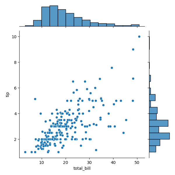
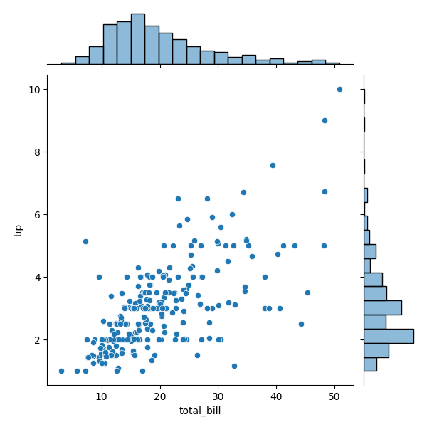
Basic example
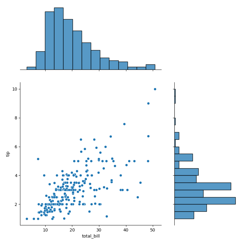
import seaborn as sns
import matplotlib.pyplot as plt
tips = sns.load_dataset("tips")
sns.jointplot(data=tips, x="total_bill", y="tip")
plt.show()
Copy to Clipboard
Central scatterplot of total_bill vs tip, Marginal histograms show distributions of each variable
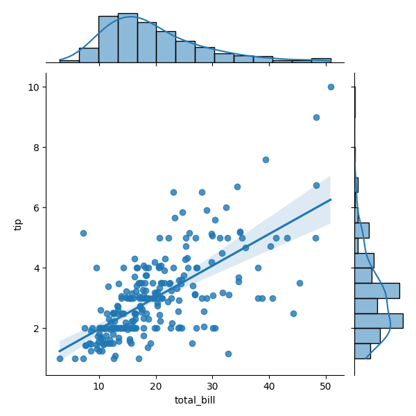
Central plot type 'reg'
import seaborn as sns
import matplotlib.pyplot as plt
tips = sns.load_dataset("tips")
sns.jointplot(data=tips, x="total_bill", y="tip", kind="reg")
plt.show()
Copy to Clipboard
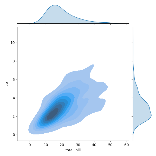
Central plot type 'kde'
import seaborn as sns
import matplotlib.pyplot as plt
tips = sns.load_dataset("tips")
sns.jointplot(data=tips, x="total_bill", y="tip", kind="kde", fill=True)
plt.show()
Copy to Clipboard
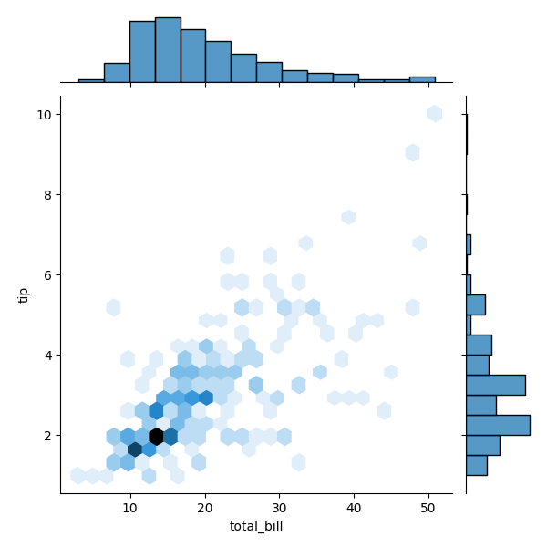
Central plot type 'hex'
import seaborn as sns
import matplotlib.pyplot as plt
tips = sns.load_dataset("tips")
sns.jointplot(data=tips, x="total_bill", y="tip", kind="hex", gridsize=25)
plt.show()
Copy to Clipboard
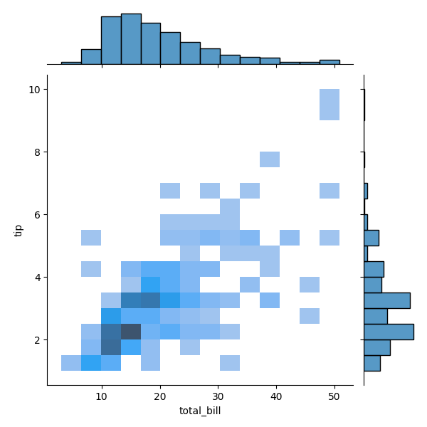
Central plot type 'hist'
import seaborn as sns
import matplotlib.pyplot as plt
tips = sns.load_dataset("tips")
sns.jointplot(data=tips, x="total_bill", y="tip", kind="hist")
plt.show()
Copy to Clipboard
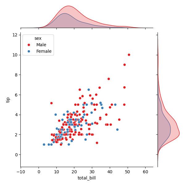
Add hue (categorical colouring)
import seaborn as sns
import matplotlib.pyplot as plt
tips = sns.load_dataset("tips")
sns.jointplot(data=tips, x="total_bill", y="tip", hue="sex", kind="scatter", palette="Set1")
plt.show()
Copy to Clipboard
Colours points by category. Marginal distributions also coloured by hue.
Customise marginals
import seaborn as sns
import matplotlib.pyplot as plt
tips = sns.load_dataset("tips")
sns.jointplot(
data=tips,
x="total_bill",
y="tip",
kind="scatter",
marginal_kws=dict(bins=20, fill=True, alpha=0.5)
)
plt.show()
Copy to Clipboard
Adjust histogram bins, fill, transparency, etc.
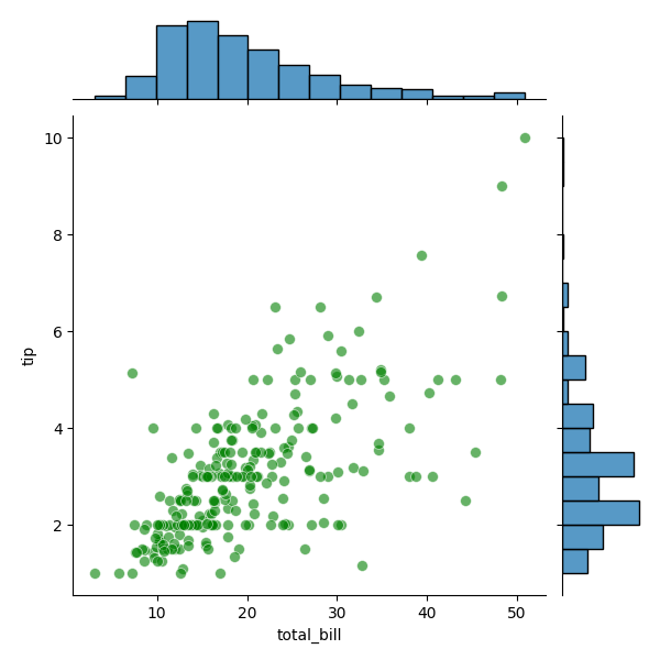
Control central plot appearance
import seaborn as sns
import matplotlib.pyplot as plt
tips = sns.load_dataset("tips")
sns.jointplot(
data=tips,
x="total_bill",
y="tip",
kind="scatter",
joint_kws=dict(alpha=0.6, s=50, color="green")
)
plt.show()
Copy to Clipboard
Change point size (s), transparency (alpha), and coluor.
Adjust size and margins
import seaborn as sns
import matplotlib.pyplot as plt
tips = sns.load_dataset("tips")
sns.jointplot(data=tips, x="total_bill", y="tip", height=8, ratio=2)
plt.show()
Copy to Clipboard
height → size of square joint plot, ratio → relative size of joint axes vs marginal axes
Products from our shop
Docker Cheat Sheet - Print at Home Designs

Docker Cheat Sheet Mouse Mat

Docker Cheat Sheet Travel Mug

Docker Cheat Sheet Mug
Vim Cheat Sheet - Print at Home Designs

Vim Cheat Sheet Mouse Mat

Vim Cheat Sheet Travel Mug

Vim Cheat Sheet Mug

SimpleSteps.guide branded Travel Mug

Developer Excuse Javascript - Travel Mug

Developer Excuse Javascript Embroidered T-Shirt - Dark

Developer Excuse Javascript Embroidered T-Shirt - Light

Developer Excuse Javascript Mug - White

Developer Excuse Javascript Mug - Black

SimpleSteps.guide branded stainless steel water bottle

Developer Excuse Javascript Hoodie - Light
