Line charts
Seaborn basics
1 min read
This section is 1 min read, full guide is 42 min read
Published Oct 7 2025, updated Aug 17 2026
24
Show sections list
0
Log in to enable the "Like" button
0
Guide comments
0
Log in to enable the "Save" button
Respond to this guide
Guide Sections
Guide Comments
ChartsGraphsMatplotlibNumPyPandasPythonSeabornVisualisation
seaborn.lineplot() draws a line plot — showing the relationship between two continuous variables, often used to display trends over time or aggregated relationships.
Syntax:
sns.lineplot( data=None, x=None, y=None, hue=None, style=None, size=None, palette=None, markers=False, dashes=True, ci='auto', estimator='mean', **kwargs)Parameters:
data= DataFrame containing datax,y= Columns to plothue= Colours (categorical/numerical grouping)style= Line style or marker shape for groupssize= Line thickness based on a variablepalette= Colour palette for huemarkers= Add point markers (True or column name)dashes= Control line dash patternsci= Confidence interval ('sd', 'auto', None)estimator= Function to aggregate data (default = mean)
Basic example
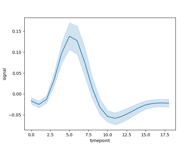
import seaborn as snsimport matplotlib.pyplot as pltdata = sns.load_dataset("fmri")sns.lineplot(data=data, x="timepoint", y="signal")plt.show()Plots the average signal value at each timepoint.
Adding hue (colour)
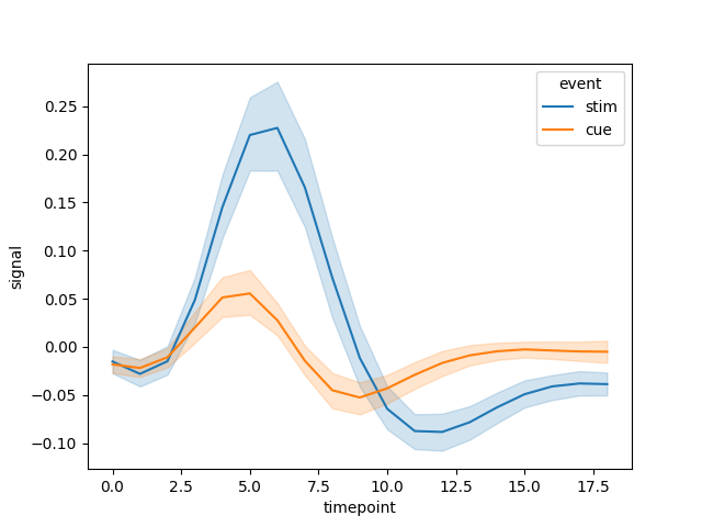
import seaborn as snsimport matplotlib.pyplot as pltdata = sns.load_dataset("fmri")sns.lineplot(data=data, x="timepoint", y="signal", hue="event")plt.show()Lines coloured by event category.
Multiple dimensions (hue, style, size)
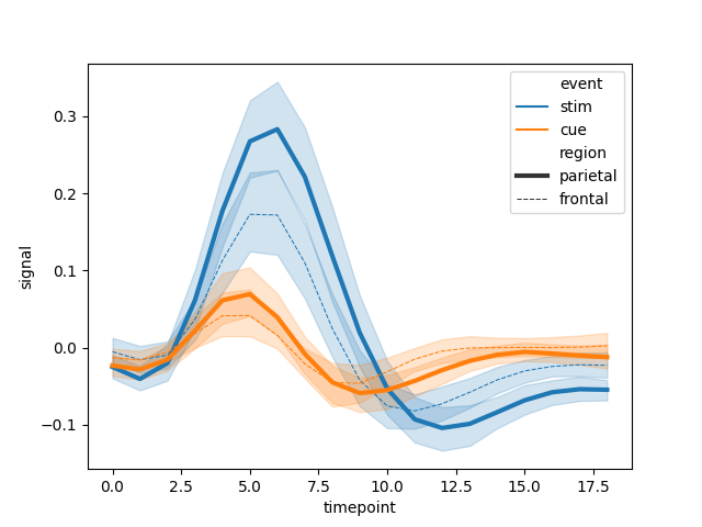
import seaborn as snsimport matplotlib.pyplot as pltdata = sns.load_dataset("fmri")sns.lineplot( data=data, x="timepoint", y="signal", hue="event", style="region", size="region")plt.show()hue→ colourstyle→ different line types (solid, dashed)size→ line thickness
Show data points with markers
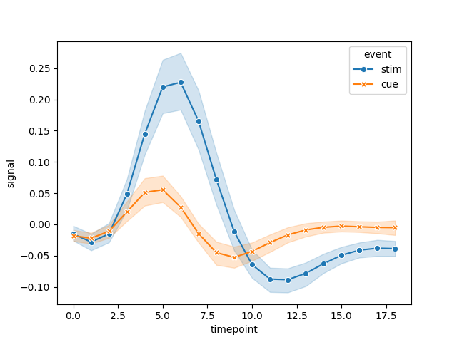
import seaborn as snsimport matplotlib.pyplot as pltdata = sns.load_dataset("fmri")sns.lineplot( data=data, x="timepoint", y="signal", hue="event", style="event", markers=True, dashes=False)plt.show()Adds markers for data points, disables dashed lines.
Control confidence intervals
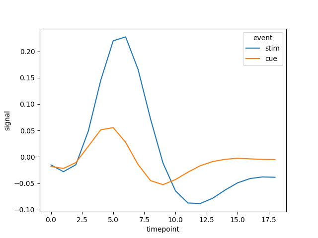
import seaborn as snsimport matplotlib.pyplot as pltdata = sns.load_dataset("fmri")sns.lineplot(data=data, x="timepoint", y="signal", hue="event", ci=None)plt.show()ci=Noneremoves shaded confidence intervals.ci='sd'shows standard deviation bands.
Use a custom estimator
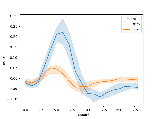
import seaborn as snsimport matplotlib.pyplot as pltimport numpy as npdata = sns.load_dataset("fmri")sns.lineplot(data=data, x="timepoint", y="signal", hue="event", estimator=np.median)plt.show()Uses median instead of mean for aggregation.
Customise appearance
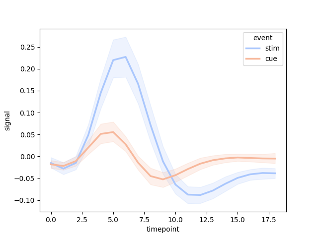
import seaborn as snsimport matplotlib.pyplot as pltdata = sns.load_dataset("fmri")sns.lineplot( data=data, x="timepoint", y="signal", hue="event", palette="coolwarm", linewidth=2.5, markers=True, dashes=False)plt.show()