LM - Linear Model plot
Seaborn basics
2 min read
This section is 2 min read, full guide is 42 min read
Published Oct 7 2025
24
Show sections list
0
Log in to enable the "Like" button
0
Guide comments
0
Log in to enable the "Save" button
Respond to this guide
Guide Sections
Guide Comments
ChartsGraphsMatplotlibNumPyPandasPythonSeabornVisualisation
seaborn.lmplot() plots data points (scatter) along with a linear regression model fit, just like sns.regplot().
However, unlike regplot(), lmplot() is a figure-level function, meaning it can create:
- Multiple subplots (facets) based on categorical variables
- Grouped regressions using color (
hue)
It’s built on top of sns.regplot() and adds faceting (via FacetGrid) for multi-group or multi-category analysis.
Syntax:
sns.lmplot(
data=None,
*,
x=None,
y=None,
hue=None,
col=None,
row=None,
palette=None,
col_wrap=None,
height=5,
aspect=1,
markers=None,
scatter=True,
fit_reg=True,
ci=95,
n_boot=1000,
order=1,
robust=False,
logx=False,
truncate=True,
x_estimator=None,
x_bins=None,
line_kws=None,
scatter_kws=None,
legend=True,
legend_out=True,
facet_kws=None,
**kwargs
)
Copy to Clipboard
Parameters:
data= DataFrame containing the datax,y= Numeric variables for regressionhue= Adds subgroups (different colours and regression lines)col,row= Facet the data into multiple subplotspalette= Colour palette for hue groupscol_wrap= Wrap facet columns into multiple rowsheight= Height (in inches) of each facetaspect= Aspect ratio (width/height) of each facetorder= Degree of polynomial regression (1 = linear)robust= Use robust regression to reduce outlier influenceci= Confidence interval width (in %)line_kws= Keyword args for line (colour, style, width, etc.)scatter_kws= Keyword args for scatter pointslegend= Show/hide legendlegend_out= Place legend outside the plot gridfacet_kws= Pass additional parameters to the FacetGrid
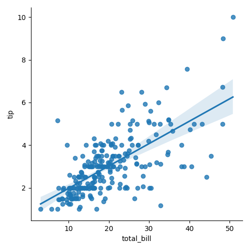
Basic example
import seaborn as sns
import matplotlib.pyplot as plt
tips = sns.load_dataset("tips")
sns.lmplot(data=tips, x="total_bill", y="tip")
plt.show()
Copy to Clipboard
Plots a scatterplot with a regression line and 95% confidence interval. Figure-level → creates its own figure and axes.
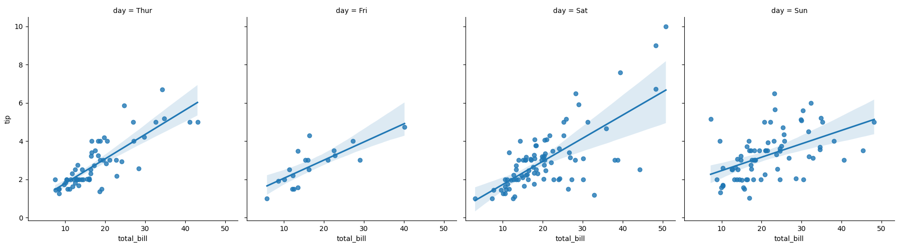
Facet into multiple columns
import seaborn as sns
import matplotlib.pyplot as plt
tips = sns.load_dataset("tips")
sns.lmplot(data=tips, x="total_bill", y="tip", col="day")
plt.show()
Copy to Clipboard
Creates one subplot per day. Each shows its own scatter + regression line.
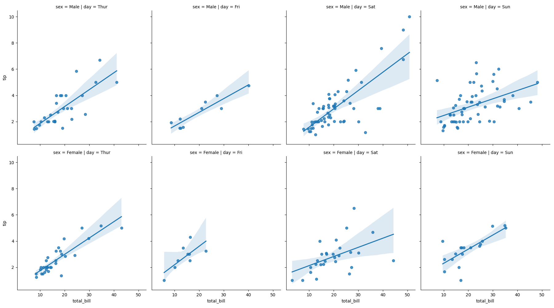
Facet by rows and columns
import seaborn as sns
import matplotlib.pyplot as plt
tips = sns.load_dataset("tips")
sns.lmplot(data=tips, x="total_bill", y="tip", col="day", row="sex")
plt.show()
Copy to Clipboard
Creates a grid of subplots, split by both day (columns) and sex (rows).
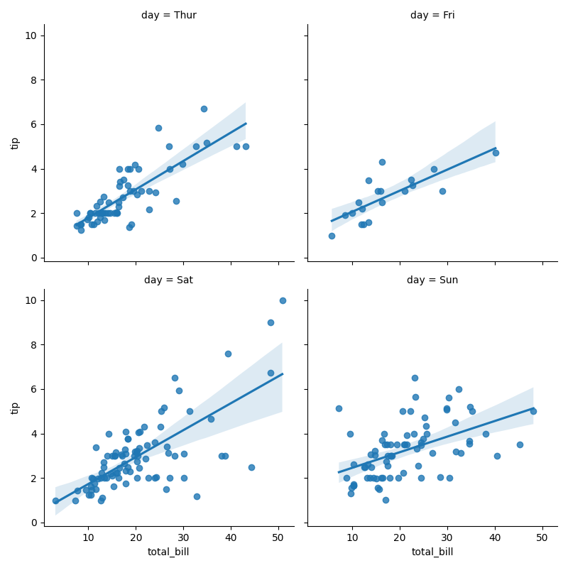
Wrap columns across rows
import seaborn as sns
import matplotlib.pyplot as plt
tips = sns.load_dataset("tips")
sns.lmplot(
data=tips,
x="total_bill",
y="tip",
col="day",
col_wrap=2,
height=4
)
plt.show()
Copy to Clipboard
Creates 2 columns per row (better layout for many facets).
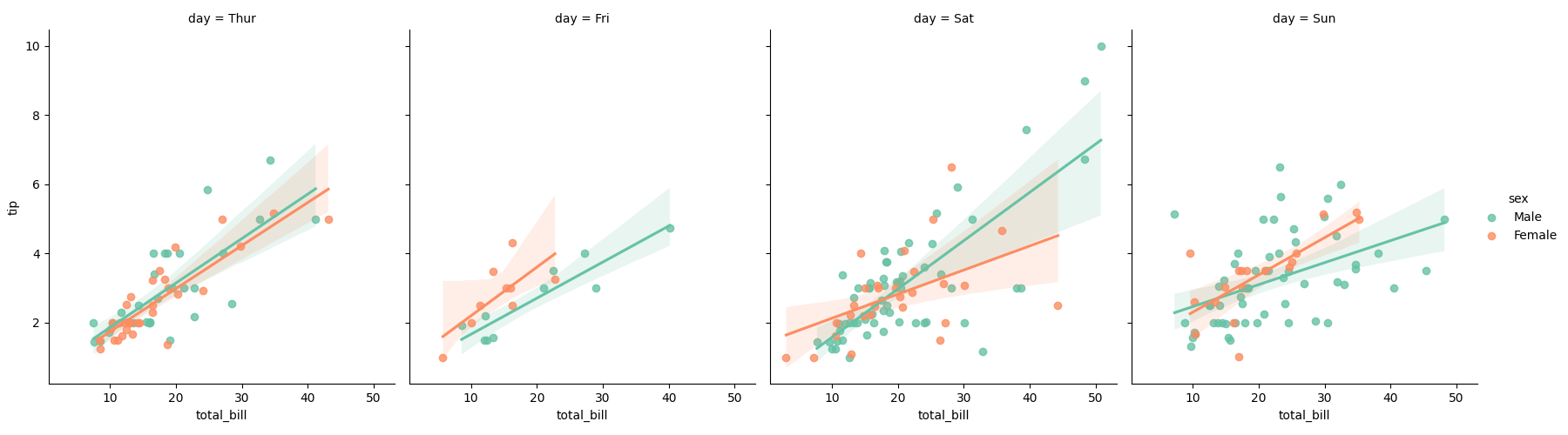
Compare groups side-by-side
import seaborn as sns
import matplotlib.pyplot as plt
tips = sns.load_dataset("tips")
sns.lmplot(
data=tips,
x="total_bill",
y="tip",
hue="sex",
col="day",
palette="Set2"
)
plt.show()
Copy to Clipboard
Multiple regression lines across columns for day, coloured by sex.
Products from our shop
Docker Cheat Sheet - Print at Home Designs

Docker Cheat Sheet Mouse Mat

Docker Cheat Sheet Travel Mug

Docker Cheat Sheet Mug
Vim Cheat Sheet - Print at Home Designs

Vim Cheat Sheet Mouse Mat

Vim Cheat Sheet Travel Mug

Vim Cheat Sheet Mug

SimpleSteps.guide branded Travel Mug

Developer Excuse Javascript - Travel Mug

Developer Excuse Javascript Embroidered T-Shirt - Dark

Developer Excuse Javascript Embroidered T-Shirt - Light

Developer Excuse Javascript Mug - White

Developer Excuse Javascript Mug - Black

SimpleSteps.guide branded stainless steel water bottle

Developer Excuse Javascript Hoodie - Light
