Multiple relational plots
Seaborn basics
1 min read
This section is 1 min read, full guide is 42 min read
Published Oct 7 2025
24
Show sections list
0
Log in to enable the "Like" button
0
Guide comments
0
Log in to enable the "Save" button
Respond to this guide
Guide Sections
Guide Comments
ChartsGraphsMatplotlibNumPyPandasPythonSeabornVisualisation
seaborn.relplot() is a figure-level function for creating relational plots — it’s basically a wrapper around sns.scatterplot() and sns.lineplot() that allows faceting (i.e., multiple subplots for different subsets of data).
It helps you visualise relationships between variables and how they change across categories.
Syntax:
sns.relplot(
data=None,
x=None,
y=None,
hue=None,
style=None,
size=None,
col=None,
row=None,
kind='scatter',
palette=None,
markers=True,
sizes=None,
col_wrap=None,
height=5,
aspect=1,
facet_kws=None,
**kwargs
)
Copy to Clipboard
Parameters:
data= DataFrame with your datax,y= Variables to plot on axeshue= Colour by variablestyle= Marker or line style by variablesize= Marker/line size by variablecol,row= Create subplots (facets) across columns or rowskind= "scatter" (default) or "line"palette= Colour palettecol_wrap= Wrap facet columns onto multiple rowsheight= Height (in inches) of each facetaspect= Aspect ratio (width/height) of each facet
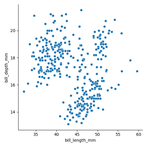
Basic example (scatter)
import seaborn as sns
import matplotlib.pyplot as plt
data = sns.load_dataset("penguins")
sns.relplot(
data=data,
x="bill_length_mm",
y="bill_depth_mm",
kind="scatter"
)
plt.show()
Copy to Clipboard
Creates a simple scatter plot of bill length vs bill depth.
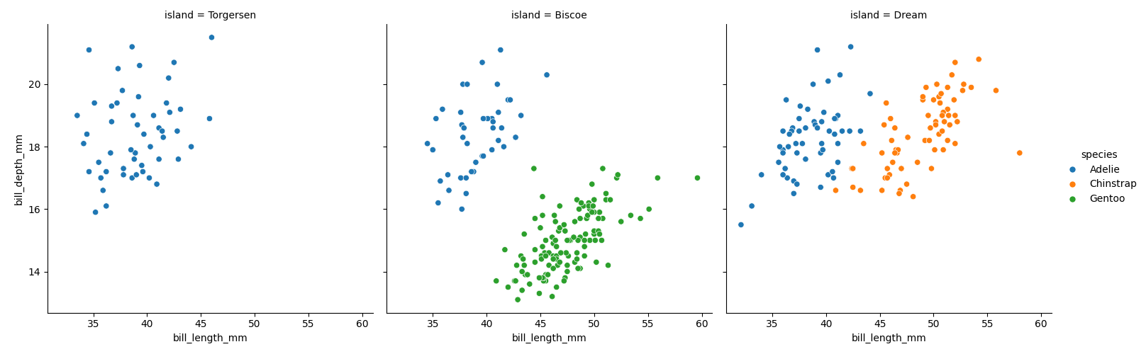
Faceting with col and row
import seaborn as sns
import matplotlib.pyplot as plt
data = sns.load_dataset("penguins")
sns.relplot(
data=data,
x="bill_length_mm",
y="bill_depth_mm",
hue="species",
col="island",
kind="scatter"
)
plt.show()
Copy to Clipboard
Creates a separate plot for each island.
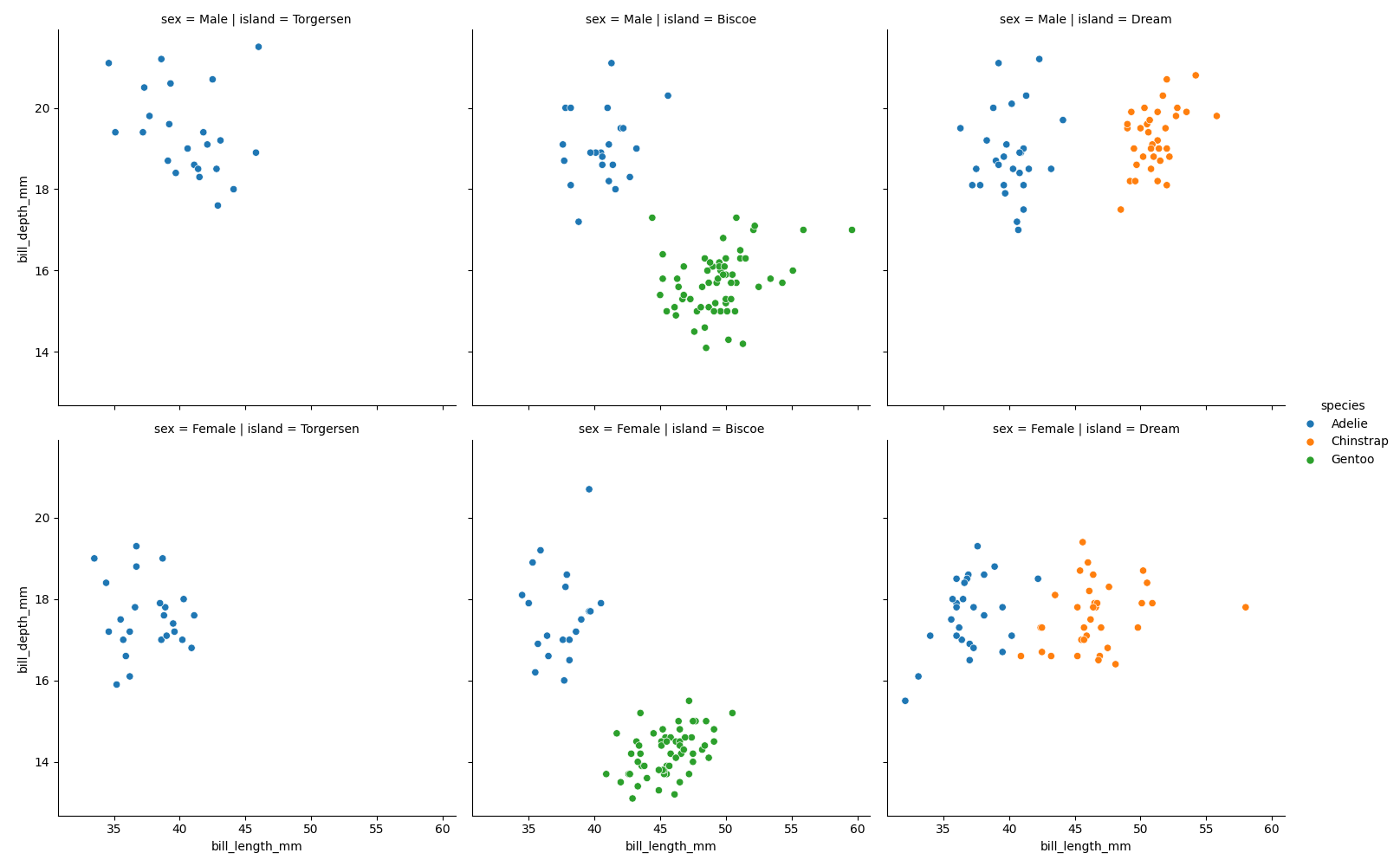
Faceting in grid (row + col)
import seaborn as sns
import matplotlib.pyplot as plt
data = sns.load_dataset("penguins")
sns.relplot(
data=data,
x="bill_length_mm",
y="bill_depth_mm",
hue="species",
col="island",
row="sex",
kind="scatter"
)
plt.show()
Copy to Clipboard
Subplots arranged by island (columns) and sex (rows).
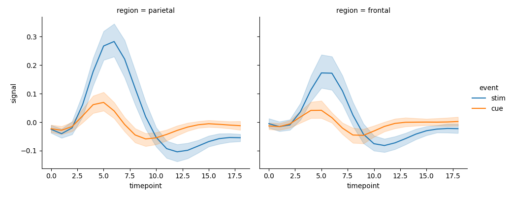
Faceting line chart
import seaborn as sns
import matplotlib.pyplot as plt
fmri = sns.load_dataset("fmri")
sns.relplot(
data=fmri,
x="timepoint",
y="signal",
hue="event",
col="region",
kind="line",
height=4,
aspect=1.2
)
plt.show()
Copy to Clipboard
Makes a grid of line plots, one for each brain region.
Products from our shop
Docker Cheat Sheet - Print at Home Designs

Docker Cheat Sheet Mouse Mat

Docker Cheat Sheet Travel Mug

Docker Cheat Sheet Mug
Vim Cheat Sheet - Print at Home Designs

Vim Cheat Sheet Mouse Mat

Vim Cheat Sheet Travel Mug

Vim Cheat Sheet Mug

SimpleSteps.guide branded Travel Mug

Developer Excuse Javascript - Travel Mug

Developer Excuse Javascript Embroidered T-Shirt - Dark

Developer Excuse Javascript Embroidered T-Shirt - Light

Developer Excuse Javascript Mug - White

Developer Excuse Javascript Mug - Black

SimpleSteps.guide branded stainless steel water bottle

Developer Excuse Javascript Hoodie - Light
