Strip plot
Seaborn basics
2 min read
This section is 2 min read, full guide is 42 min read
Published Oct 7 2025
24
Show sections list
0
Log in to enable the "Like" button
0
Guide comments
0
Log in to enable the "Save" button
Respond to this guide
Guide Sections
Guide Comments
ChartsGraphsMatplotlibNumPyPandasPythonSeabornVisualisation
seaborn.stripplot() displays individual data points for a numerical variable across categories.
It’s a type of scatter plot where:
- The x-axis (or y-axis) shows categories
- The other axis shows numeric values
- Each dot represents one observation
It’s great for:
- Showing raw data instead of summary statistics
- Understanding data distribution, density, and outliers
Syntax:
sns.stripplot(
data=None,
x=None,
y=None,
hue=None,
order=None,
hue_order=None,
jitter=True,
dodge=False,
orient=None,
color=None,
palette=None,
size=5,
alpha=None,
marker='o',
linewidth=0,
**kwargs
)
Copy to Clipboard
Parameters:
data= DataFrame containing your datax,y= Categorical and numeric variableshue= Adds subcategories (colours)jitter= Adds random noise to avoid overlapping points (default: True)dodge= Separates hue categories side by sidepalette= Colour palette for huesize= Dot sizealpha= Transparency (0 to 1)marker= Shape of the pointslinewidth= Outline thickness for points
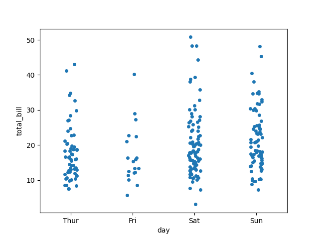
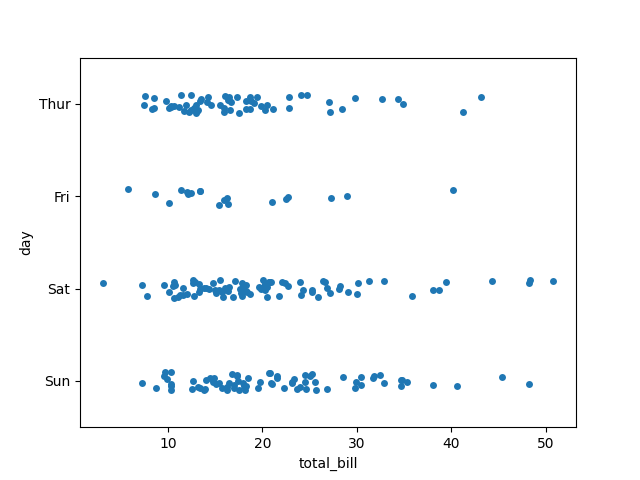
Basic example
import seaborn as sns
import matplotlib.pyplot as plt
tips = sns.load_dataset("tips")
sns.stripplot(data=tips, x="day", y="total_bill")
plt.show()
Copy to Clipboard
Each dot = one observation of total_bill for a given day.
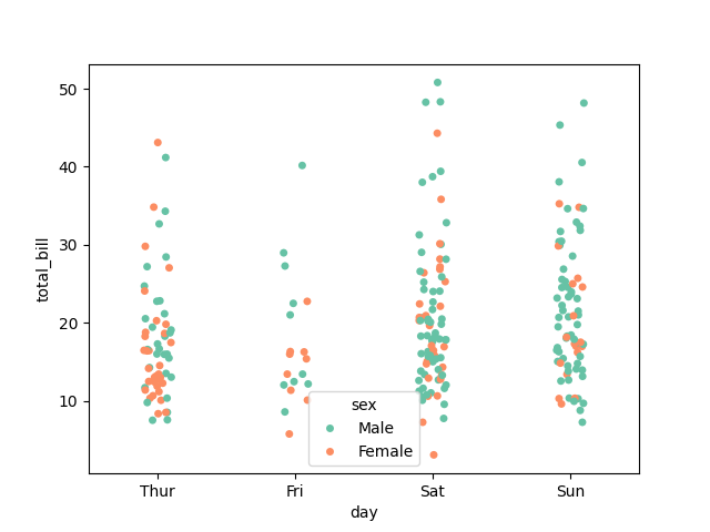
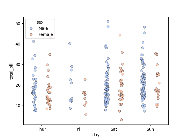
Add hue (subgroups)
import seaborn as sns
import matplotlib.pyplot as plt
tips = sns.load_dataset("tips")
sns.stripplot(data=tips, x="day", y="total_bill", hue="sex", palette="Set2")
plt.show()
Copy to Clipboard
- Dots are coloured by sex.
- Default behaviour: dots from different hue groups overlap slightly.
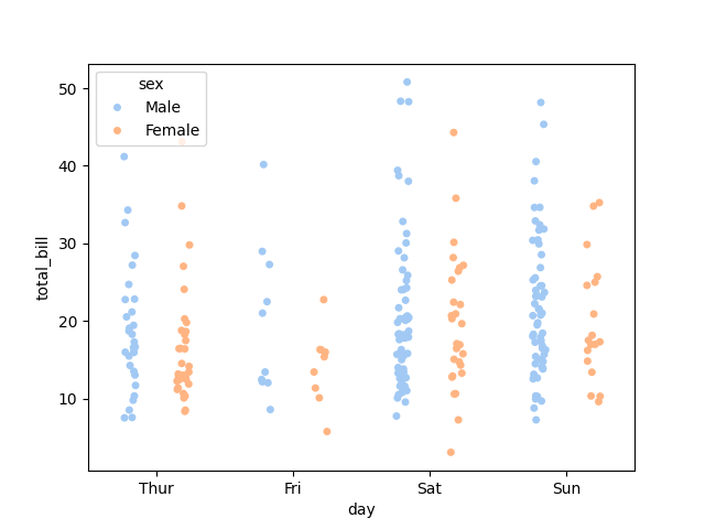
Separate subgroups (dodge)
import seaborn as sns
import matplotlib.pyplot as plt
tips = sns.load_dataset("tips")
sns.stripplot(data=tips, x="day", y="total_bill", hue="sex", dodge=True, palette="pastel")
plt.show()
Copy to Clipboard
Dots for different hue groups appear side by side, avoiding overlap.
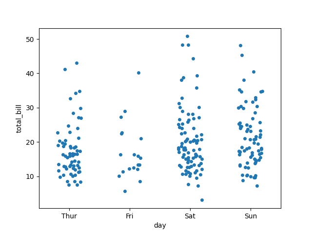
Control jitter (spread of points)
import seaborn as sns
import matplotlib.pyplot as plt
tips = sns.load_dataset("tips")
sns.stripplot(data=tips, x="day", y="total_bill", jitter=0.2)
plt.show()
Copy to Clipboard
jitter=True(default): spreads points horizontally for visibility.jitter=0: stacks points directly above each other (no spread).
Horizontal orientation
import seaborn as sns
import matplotlib.pyplot as plt
tips = sns.load_dataset("tips")
sns.stripplot(data=tips, x="total_bill", y="day", orient="h")
plt.show()
Copy to Clipboard
Flips the orientation — useful for long category names.
Customise style and colors
import seaborn as sns
import matplotlib.pyplot as plt
tips = sns.load_dataset("tips")
sns.stripplot(
data=tips,
x="day",
y="total_bill",
hue="sex",
dodge=True,
palette="coolwarm",
size=6,
alpha=0.7,
linewidth=0.5,
edgecolor="black"
)
plt.show()
Copy to Clipboard
size→ dot sizealpha→ transparencylinewidth+edgecolor→ outline styling
Products from our shop
Docker Cheat Sheet - Print at Home Designs

Docker Cheat Sheet Mouse Mat

Docker Cheat Sheet Travel Mug

Docker Cheat Sheet Mug
Vim Cheat Sheet - Print at Home Designs

Vim Cheat Sheet Mouse Mat

Vim Cheat Sheet Travel Mug

Vim Cheat Sheet Mug

SimpleSteps.guide branded Travel Mug

Developer Excuse Javascript - Travel Mug

Developer Excuse Javascript Embroidered T-Shirt - Dark

Developer Excuse Javascript Embroidered T-Shirt - Light

Developer Excuse Javascript Mug - White

Developer Excuse Javascript Mug - Black

SimpleSteps.guide branded stainless steel water bottle

Developer Excuse Javascript Hoodie - Light
