Swarm plot
Seaborn basics
2 min read
This section is 2 min read, full guide is 42 min read
Published Oct 7 2025
24
Show sections list
0
Log in to enable the "Like" button
0
Guide comments
0
Log in to enable the "Save" button
Respond to this guide
Guide Sections
Guide Comments
ChartsGraphsMatplotlibNumPyPandasPythonSeabornVisualisation
seaborn.swarmplot() is used to display individual data points for one or more categorical variables, similar to sns.stripplot().
However, unlike stripplot, it automatically arranges (swarm) the points so that they don’t overlap — creating a cleaner, more readable visualisation.
You can think of it as a “smarter” stripplot that spreads points apart along the categorical axis while keeping their exact numeric values.
Syntax:
sns.swarmplot(
data=None,
x=None,
y=None,
hue=None,
order=None,
hue_order=None,
dodge=False,
orient=None,
color=None,
palette=None,
size=5,
marker='o',
linewidth=0,
edgecolor=None,
alpha=None,
**kwargs
)
Copy to Clipboard
Parameters:
data= DataFrame containing the datax,y= Categorical and numerical variableshue= Adds subgroups with different coloursorder,hue_order= Category/subcategory orderpalette= Colour schemesize= Dot sizealpha= Transparency (0–1)marker= Shape of the dots (e.g., 'o', 's', '^')dodge= Places hue subgroups side by sideorient= "v" (vertical) or "h" (horizontal)linewidth,edgecolor= Outline style for dots
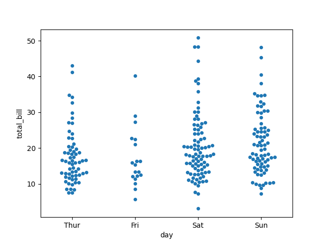
Basic example
import seaborn as sns
import matplotlib.pyplot as plt
tips = sns.load_dataset("tips")
sns.swarmplot(data=tips, x="day", y="total_bill")
plt.show()
Copy to Clipboard
Each dot = one observation of total_bill on a specific day. Dots are evenly spaced, so none overlap.
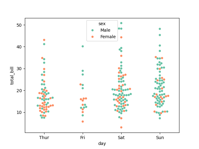
Add hue (subgroups)
import seaborn as sns
import matplotlib.pyplot as plt
tips = sns.load_dataset("tips")
sns.swarmplot(data=tips, x="day", y="total_bill", hue="sex", palette="Set2")
plt.show()
Copy to Clipboard
- Dots are coloured by the
sexcolumn. - Each day now has two overlapping but neatly separated swarms.
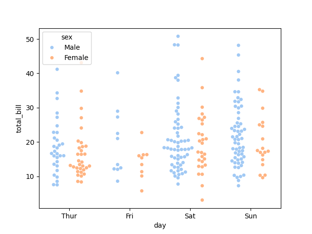
Separate subgroups (dodge)
import seaborn as sns
import matplotlib.pyplot as plt
tips = sns.load_dataset("tips")
sns.swarmplot(data=tips, x="day", y="total_bill", hue="sex", dodge=True, palette="pastel")
plt.show()
Copy to Clipboard
Dots for different hue categories appear side by side (not overlapping).
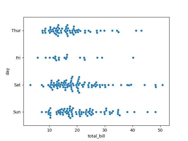
Horizontal swarmplot
import seaborn as sns
import matplotlib.pyplot as plt
tips = sns.load_dataset("tips")
sns.swarmplot(data=tips, x="total_bill", y="day", orient="h")
plt.show()
Copy to Clipboard
Same data — just flipped horizontally. Useful when category names are long or when numeric range fits better on the x-axis.
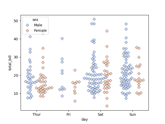
Customise style
import seaborn as sns
import matplotlib.pyplot as plt
tips = sns.load_dataset("tips")
sns.swarmplot(
data=tips,
x="day",
y="total_bill",
hue="sex",
dodge=True,
size=6,
palette="coolwarm",
marker="D",
alpha=0.7,
linewidth=0.5,
edgecolor="black"
)
plt.show()
Copy to Clipboard
size→ dot sizemarker→ shape ("o","s","D","^", etc.)alpha→ transparencyedgecolor→ outline colour
Products from our shop
Docker Cheat Sheet - Print at Home Designs

Docker Cheat Sheet Mouse Mat

Docker Cheat Sheet Travel Mug

Docker Cheat Sheet Mug
Vim Cheat Sheet - Print at Home Designs

Vim Cheat Sheet Mouse Mat

Vim Cheat Sheet Travel Mug

Vim Cheat Sheet Mug

SimpleSteps.guide branded Travel Mug

Developer Excuse Javascript - Travel Mug

Developer Excuse Javascript Embroidered T-Shirt - Dark

Developer Excuse Javascript Embroidered T-Shirt - Light

Developer Excuse Javascript Mug - White

Developer Excuse Javascript Mug - Black

SimpleSteps.guide branded stainless steel water bottle

Developer Excuse Javascript Hoodie - Light
