Violin plots
Seaborn basics
2 min read
This section is 2 min read, full guide is 42 min read
Published Oct 7 2025
24
Show sections list
0
Log in to enable the "Like" button
0
Guide comments
0
Log in to enable the "Save" button
Respond to this guide
Guide Sections
Guide Comments
ChartsGraphsMatplotlibNumPyPandasPythonSeabornVisualisation
seaborn.violinplot() visualizes the distribution of a numerical variable for one or more categories — similar to a boxplot, but with a smoothed kernel density estimate (KDE) on each side.
You can think of it as a boxplot + density curve combined.
It shows:
- The median (white dot by default)
- The interquartile range (IQR) (thick black bar)
- The full data range (thin line)
Syntax:
sns.violinplot(
data=None,
x=None,
y=None,
hue=None,
order=None,
hue_order=None,
bw='scott',
cut=2,
scale='area',
scale_hue=True,
gridsize=100,
width=0.8,
inner='box',
split=False,
dodge=True,
orient=None,
linewidth=None,
palette=None,
**kwargs
)
Copy to Clipboard
Parameters:
data= DataFrame containing the datax,y= Variables for categories and numeric valueshue= Adds subcategories (split violins)order,hue_order= Category orderpalette= Colour schemebw= Bandwidth for KDE smoothingcut= Extent to which the violin extends beyond data rangescale= 'area', 'count', or 'width' — how violins are sizedinner= What to show inside the violin: 'box', 'quartile', 'point', 'stick', or Nonesplit= If True, split violins for hue categorieswidth= Violin widthorient= "v" (vertical) or "h" (horizontal)
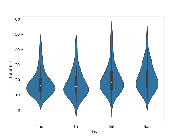
Basic example
import seaborn as sns
import matplotlib.pyplot as plt
tips = sns.load_dataset("tips")
sns.violinplot(data=tips, x="day", y="total_bill")
plt.show()
Copy to Clipboard
Shows the distribution of total_bill for each day.
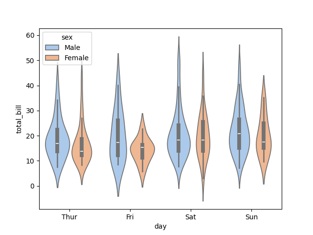
Add hue (subgroups)
import seaborn as sns
import matplotlib.pyplot as plt
tips = sns.load_dataset("tips")
sns.violinplot(data=tips, x="day", y="total_bill", hue="sex", palette="pastel")
plt.show()
Copy to Clipboard
- Each day has two violins, one for each sex.
- By default, they’re placed side by side.
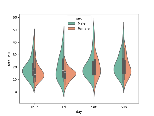
Split violins (compare distributions directly)
import seaborn as sns
import matplotlib.pyplot as plt
tips = sns.load_dataset("tips")
sns.violinplot(
data=tips,
x="day",
y="total_bill",
hue="sex",
split=True,
palette="Set2"
)
plt.show()
Copy to Clipboard
Splits the violins in half (left vs. right) for each subgroup. Great for direct visual comparison.
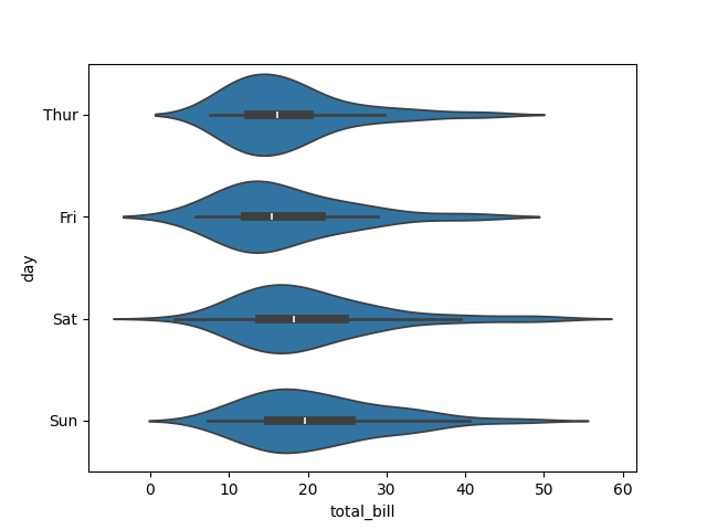
Horizontal violin plot
import seaborn as sns
import matplotlib.pyplot as plt
tips = sns.load_dataset("tips")
sns.violinplot(data=tips, x="total_bill", y="day", orient="h")
plt.show()
Copy to Clipboard
Flips the violins horizontally — good for long category labels.
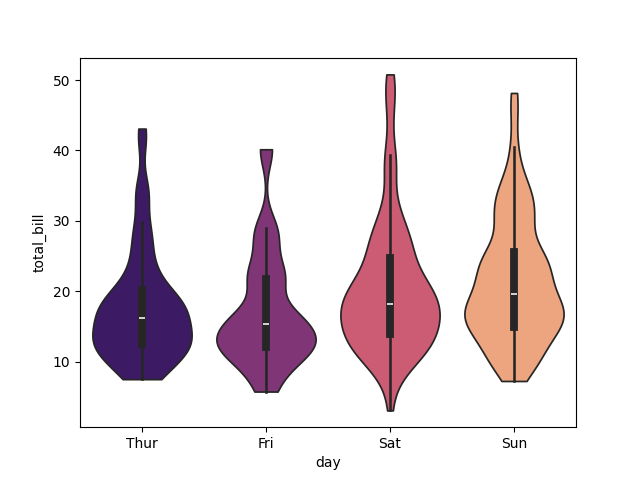
Customise inner display
import seaborn as sns
import matplotlib.pyplot as plt
tips = sns.load_dataset("tips")
sns.violinplot(
data=tips,
x="day",
y="total_bill",
inner="quartile",
palette="coolwarm"
)
plt.show()
Copy to Clipboard
Options for inner:
'box'= Small boxplot inside each violin (default)'quartile'= Horizontal lines for quartiles'point'= Dots for data points'stick'= Small vertical lines for each observation- None = Removes internal marks
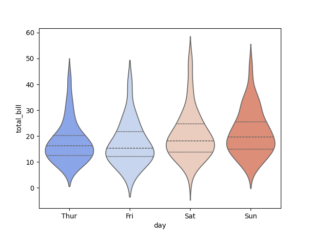
Adjust smoothness & width
import seaborn as sns
import matplotlib.pyplot as plt
tips = sns.load_dataset("tips")
sns.violinplot(
data=tips,
x="day",
y="total_bill",
bw=0.3,
cut=0,
scale="width",
palette="magma"
)
plt.show()
Copy to Clipboard
bw: bandwidth for KDE (controls smoothness).cut: how far violins extend beyond actual data.scale: how violins are scaled ('area','width','count').
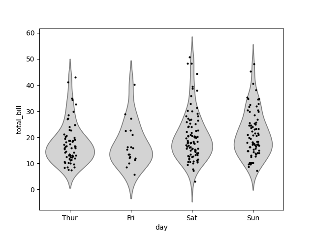
Overlay raw data for context
import seaborn as sns
import matplotlib.pyplot as plt
tips = sns.load_dataset("tips")
sns.violinplot(data=tips, x="day", y="total_bill", inner=None, color="lightgray")
sns.stripplot(data=tips, x="day", y="total_bill", color="black", size=3, jitter=True)
plt.show()
Copy to Clipboard
Shows the smooth distribution (violin) + individual data points (stripplot).
Products from our shop
Docker Cheat Sheet - Print at Home Designs

Docker Cheat Sheet Mouse Mat

Docker Cheat Sheet Travel Mug

Docker Cheat Sheet Mug
Vim Cheat Sheet - Print at Home Designs

Vim Cheat Sheet Mouse Mat

Vim Cheat Sheet Travel Mug

Vim Cheat Sheet Mug

SimpleSteps.guide branded Travel Mug

Developer Excuse Javascript - Travel Mug

Developer Excuse Javascript Embroidered T-Shirt - Dark

Developer Excuse Javascript Embroidered T-Shirt - Light

Developer Excuse Javascript Mug - White

Developer Excuse Javascript Mug - Black

SimpleSteps.guide branded stainless steel water bottle

Developer Excuse Javascript Hoodie - Light
